You’ve stood in front of your closet (or your living room, or your mood board) staring at a striped piece and a floral piece, desperately wanting to combine them — but terrified the result will look like a yard sale explosion. Good news: mixing patterns is absolutely a learnable skill, and once you crack the code, you’ll never look at a “plain” outfit or room the same way again.
Start With a Consistent Color Palette
The single most important rule in pattern mixing? Keep your colors talking to each other. When two wildly different patterns share even one or two common colors, the eye reads them as intentional rather than accidental.
- Pick a dominant color and let it appear in every pattern you use.
- Use neutrals (white, beige, black, camel) as a bridge between bolder prints.
- Don’t be afraid of tone-on-tone — a navy stripe with a navy floral is sophisticated, not boring.
Think of your color palette as the thread stitching the whole look together. Get this right, and the patterns almost mix themselves.
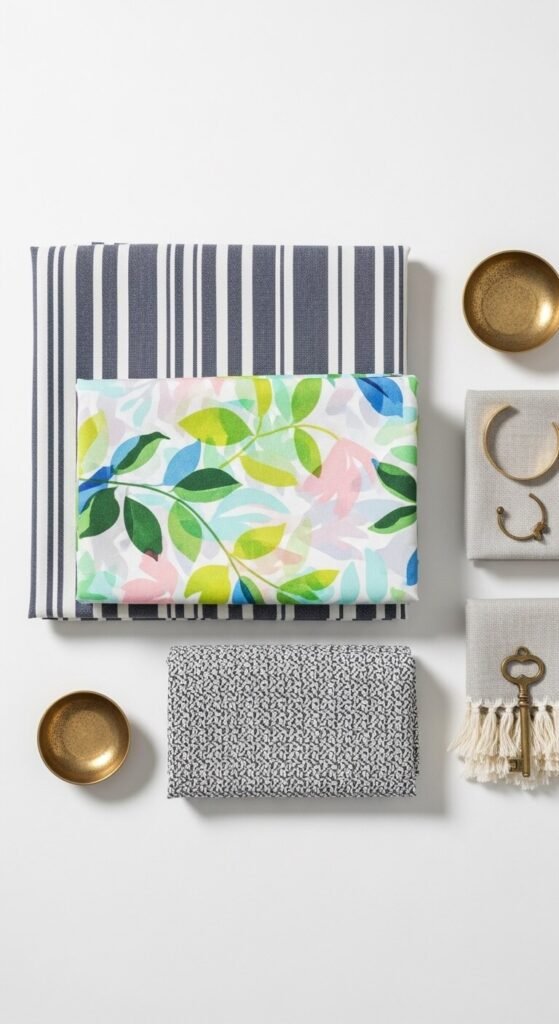
Vary the Scale of Your Prints
This is the secret weapon most people overlook. Pairing a large-scale print with a small-scale print creates visual contrast that feels dynamic instead of chaotic.
- Large + Small: A bold oversized floral with a tiny gingham check. Chef’s kiss.
- Large + Medium: Works beautifully in interiors — think a big botanical wallpaper with medium-scale throw pillows.
- Avoid: Two prints of nearly identical scale. They’ll compete and confuse the eye.
A good rule of thumb: if you squint at your combination and can still tell the two patterns apart, you’re in good shape.
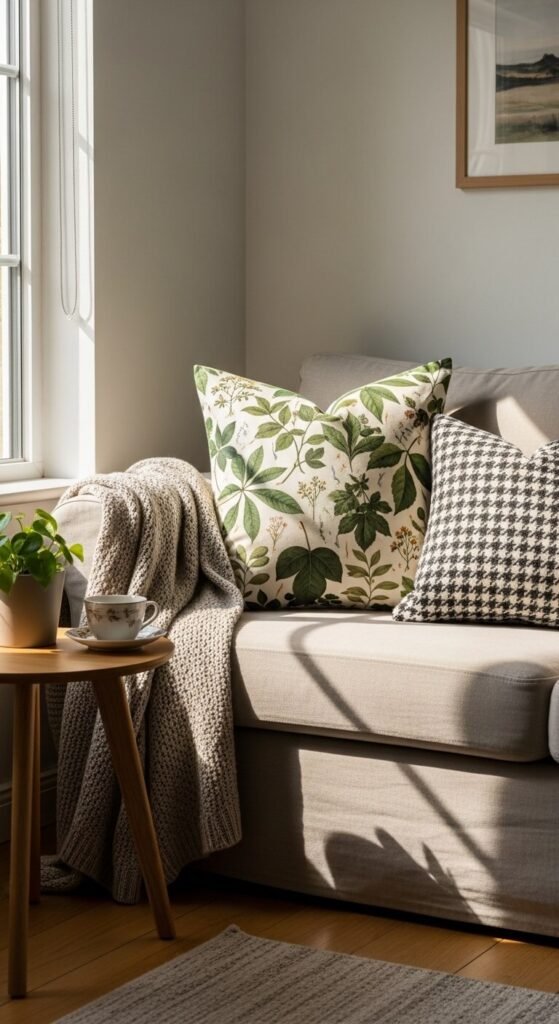
Mix Pattern Families — With Intention
Not all patterns are created equal. There are distinct “families” — geometrics, florals, stripes, animal prints, abstract, and plaids — and knowing how to cross families is what separates a good look from a great one.
Some tried-and-true combinations:
- Stripes + Florals: Classic and timeless. The structure of stripes grounds the softness of florals.
- Animal Print + Geometric: Unexpected but editorial. Let the animal print be the star.
- Plaid + Stripe: A preppy, layered look that works especially well in fall palettes.
The key is to let one pattern lead and let the others support. Think of it like a band — there’s a lead singer, and then there’s the backing vocals.

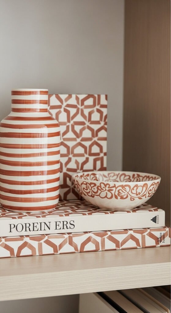
Use Texture as a Pattern
Here’s a trick the pros use constantly: texture counts as a pattern. A chunky cable-knit, a woven rattan basket, or a velvet cushion all add visual interest without technically being a “print.” This lets you layer richness without overwhelming the eye.
When your pattern mix starts to feel like too much, swap one print for a textured solid. It breaks up the noise while keeping the depth.
The 3-Pattern Rule (And When to Break It)
A helpful framework for beginners: stick to three patterns maximum in a single look or vignette. This gives you enough visual interest without tipping into overwhelm.
- Pattern 1: Your dominant, largest-scale print.
- Pattern 2: A secondary, complementary print in a different scale.
- Pattern 3: A subtle accent — a thin stripe, a small check, a barely-there texture.
Once you’re comfortable, feel free to break this rule. Fashion icons and interior designers do it constantly — but they’re working from a solid foundation of the principles above.
Confidence Is the Final Ingredient
At the end of the day, the most important element in any pattern mix is conviction. A bold combination worn with confidence reads as intentional. The same combination worn with hesitation just looks like a mistake.
Start small — mix a patterned scarf with a subtle printed top. Then graduate to full pattern-on-pattern outfits or a maximalist gallery wall. Trust your eye. It develops faster than you think.
Save this guide for your next styling session — and go ahead, pull out that floral and that stripe. You’ve got this.