There’s a reason neutral interiors never go out of style — but there’s also a reason so many of them fall flat. Done wrong, a neutral palette can feel like an unfinished hotel room. Done right? It feels like the coziest, most effortlessly chic place you’ve ever walked into. The secret isn’t avoiding color — it’s understanding how to layer warmth, texture, and depth without it.
Start with a Warm Neutral Base (Not Stark White)
The first mistake most people make? Reaching for a cool, bright white and wondering why the room feels cold and clinical.
Instead, choose neutrals with warm undertones:
- Warm whites like Swiss Coffee or Antique White
- Greige tones (gray + beige) that shift depending on the light
- Soft terracottas or sandy beiges for a more earthy, grounded feel
Your walls set the entire emotional tone of the room. A warm base does half the work for you before a single piece of furniture goes in.
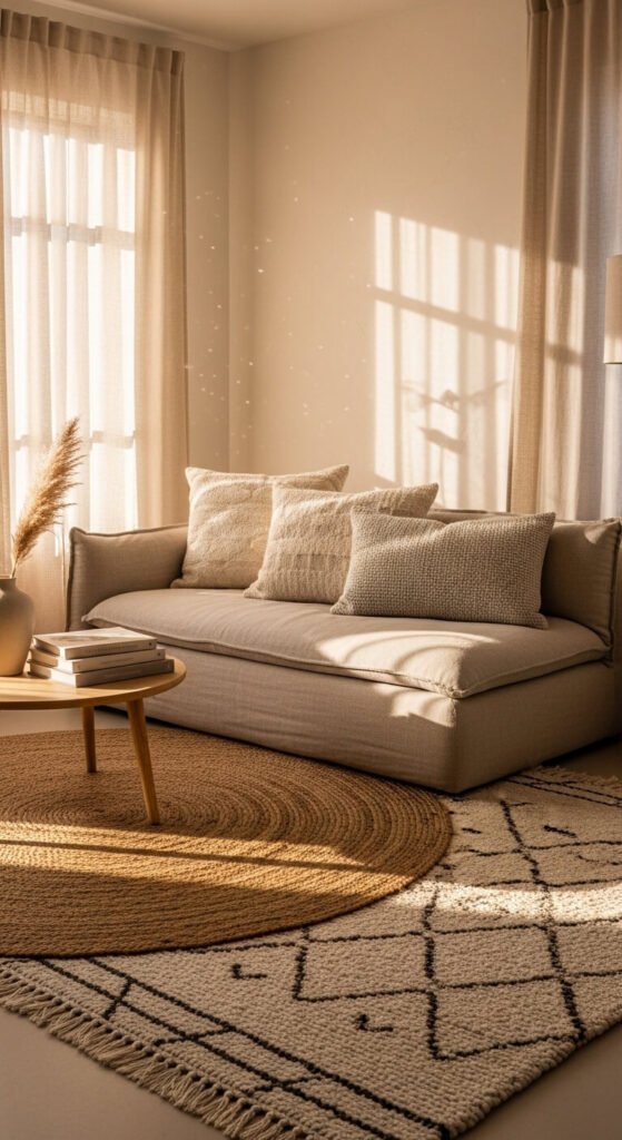
Layer at Least Three Different Textures
This is the single most important rule in neutral decorating. When you remove color contrast, texture becomes your contrast.
Think of it like this: if everything is smooth and flat, the eye has nowhere interesting to land. But mix a rough jute rug with a silky throw pillow and a matte ceramic vase? Suddenly the room has dimension.
Try layering:
- Chunky knit or linen throws on sofas and chairs
- Woven baskets for storage that doubles as décor
- Wooden elements — raw, reclaimed, or light-toned
- Bouclé or velvet upholstery for softness and visual interest
- Natural stone or travertine on coffee tables or trays
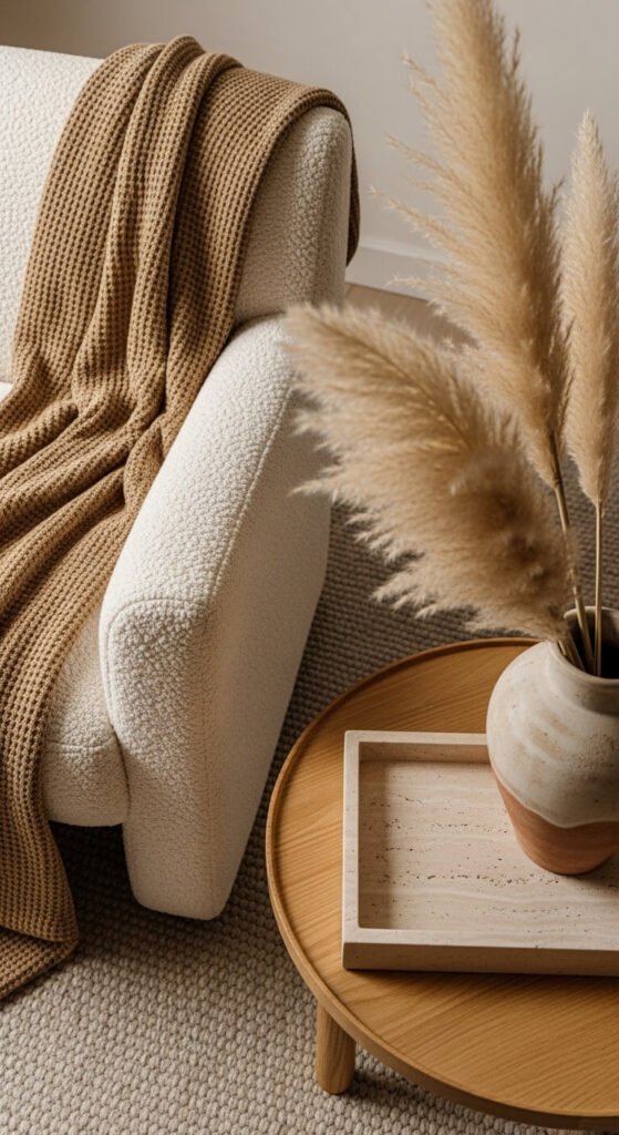
Bring In Organic and Natural Elements
One of the fastest ways to make a neutral room feel alive is to add things that come from nature. Plants, dried botanicals, raw wood, linen, and stone all carry an inherent warmth that no paint color can replicate.
Some easy ways to do this:
- A large leafy plant (fiddle leaf fig, olive tree, or monstera) in a woven or terracotta pot
- A wooden bowl filled with pinecones, stones, or seasonal fruit on a dining table
- Dried pampas grass or eucalyptus in a tall vase for effortless texture
- Linen curtains that puddle slightly on the floor for a soft, lived-in feel
The goal is to make the space feel like it grew that way — curated, but not stiff.
Use the “60-30-10” Rule — With a Twist
The classic interior design formula says: 60% dominant color, 30% secondary, 10% accent. In a neutral palette, apply it like this:
- 60% — Your base neutral (walls, large sofa, rugs)
- 30% — A secondary warm tone (think camel, rust, warm taupe, or blush)
- 10% — A grounding darker element (black candle holders, dark walnut wood, charcoal cushions)
That 10% is crucial. A touch of dark anchors a neutral room and keeps it from floating away into “bland.” Don’t skip it.
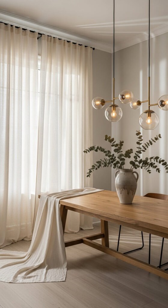
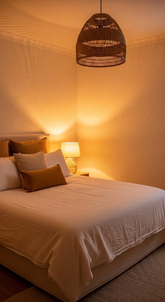
Add Warmth Through Lighting
No amount of beautiful décor can save a room with harsh, cool lighting. Lighting is the invisible layer of interior design — and in a neutral space, it matters even more.
- Swap cool LED bulbs for warm-toned bulbs (2700K–3000K)
- Layer your light sources: floor lamps + table lamps + overhead = instant depth
- Add candles or LED candles for ambiance in the evenings
- Let in as much natural light as possible — sheer curtains over blackout panels are your best friend
Don’t Forget Personal Touches
A neutral room without personality still feels empty. The warmth comes from you, too.
- A stack of well-loved books on a coffee table
- A vintage tray with perfume bottles or candles on a dresser
- Family photos in simple natural wood or black frames
- A market basket left casually by the door
These small, human details are what make a house feel like a home.
The bottom line: Neutrals aren’t boring — boring neutrals are boring. When you lead with warmth, layer texture intentionally, and let natural elements do the heavy lifting, a neutral palette becomes one of the most timeless, versatile, and deeply cozy choices you can make.
✨ Save this article for your next room refresh — and remember, it’s all in the layers.