There’s a reason some rooms feel finished and others feel like something’s missing — and nine times out of ten, it comes down to the walls. Wall art isn’t just decoration; it’s the personality of your space. It sets the mood, tells your story, and ties everything together. But walking into a home décor store (or scrolling endlessly on Pinterest) can feel overwhelming fast. Don’t worry — choosing the right wall art is simpler than you think when you know what to look for.
Start With the Feeling You Want to Create
Before you even think about colors or sizes, ask yourself: How do I want this room to feel?
- Calm and cozy? Think soft landscapes, muted watercolors, or botanical prints.
- Bold and energetic? Go for graphic abstract art, high-contrast photography, or oversized statement pieces.
- Warm and personal? Family portraits, travel photography, or hand-lettered quotes work beautifully.
Your art should amplify the mood you’re already building — not fight against it. If your room is all clean lines and minimal furniture, a chaotic maximalist print will clash. If your space is eclectic and layered, a single stark print might disappear.
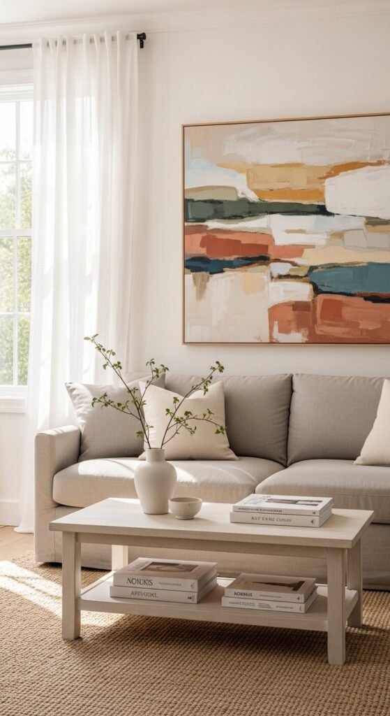
Match the Scale to the Wall
One of the most common mistakes? Hanging art that’s way too small for the wall. A tiny frame floating alone on a large wall always looks like an afterthought.
Here’s a simple rule of thumb:
- Your art (or gallery wall) should fill about 60–75% of the available wall width.
- Above a sofa, aim for a piece that’s roughly two-thirds the length of the sofa.
- In a narrow hallway, go vertical — tall, slim pieces make the space feel taller.
When in doubt, use painter’s tape to map out the dimensions on your wall before buying. It takes two minutes and saves a lot of returns.
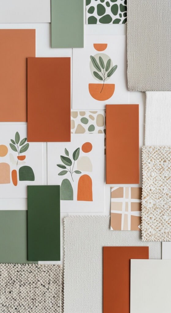
Use Color to Connect, Not Compete
Wall art is one of the easiest ways to pull a color palette together — but only if you choose intentionally.
- Pull a color from your existing décor. If your throw pillows have a dusty terracotta stripe, a print with those same warm tones will feel cohesive instantly.
- Contrast with purpose. A deep navy print can look stunning against a warm white wall — just make sure it echoes something else in the room.
- Don’t match too perfectly. Art that’s the exact same shade as your sofa looks planned in a boring way. Aim for harmony, not uniformity.
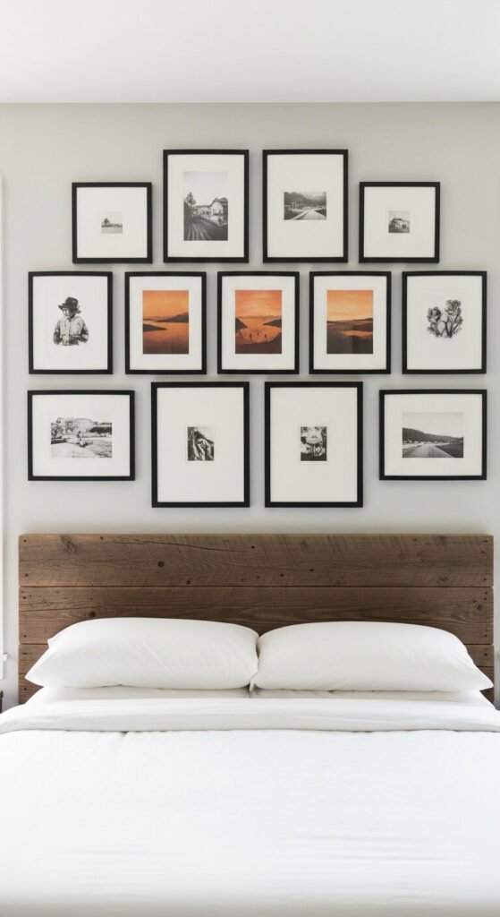
Think About Frames and Finishing
The art matters — but so does how you present it. Frames can completely transform a piece.
- Thin metal frames feel modern and minimal.
- Chunky wood frames add warmth and a rustic or organic touch.
- No frame at all (canvas or tapestry) lends a relaxed, boho vibe.
- Matted prints instantly elevate even a simple photo, making it feel gallery-worthy.
Mixing frame styles can work beautifully in a gallery wall, but try to keep one consistent element — whether that’s the frame color, the mat color, or the overall print style.
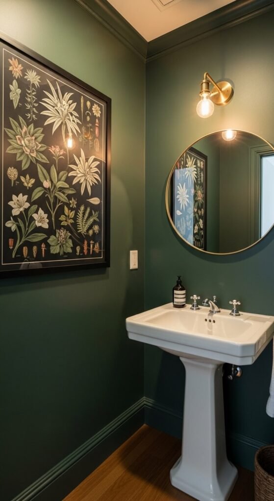
Don’t Forget Unexpected Spaces
Most people think: living room, bedroom, done. But some of the most impactful art placements are the ones nobody expects.
- A single bold print in a powder room creates a memorable moment.
- Leaning art against the wall on a shelf or console table feels effortlessly relaxed.
- A kitchen wall with vintage botanical or food-themed prints adds charm without feeling kitschy.
Your Walls Are Waiting
Choosing wall art doesn’t have to be stressful — it’s one of the most personal and fun parts of decorating. Start with the feeling you want, respect the scale of your space, and let color be your guide. When something makes you stop and smile? That’s the one.
Save this guide for your next decorating project — and share it with a friend who’s been staring at a blank wall for way too long! 🎨