Ever hung a piece of art that looked perfect at the store, only to bring it home and watch it shrink into a tiny, lonely square on a giant blank wall? You’re not imagining it — and you’re definitely not alone. Artwork size is one of the most common (and most fixable) design mistakes in any home.
The fix isn’t about taste — it’s about math. Let’s break down the simple formulas that make artwork look intentional instead of accidental.
Why Size Matters More Than Style
You can have the most beautiful painting in the world, but if it’s the wrong size for the space, it will always feel off. Here’s why proportion is everything:
- Too small, and art looks like an afterthought floating in empty space
- Too large, and it can overwhelm the furniture or room
- The right size creates balance and makes a room feel “finished”
- Proportion affects how your eye moves through a space
Once you understand the basic ratios, you’ll never have to guess again.
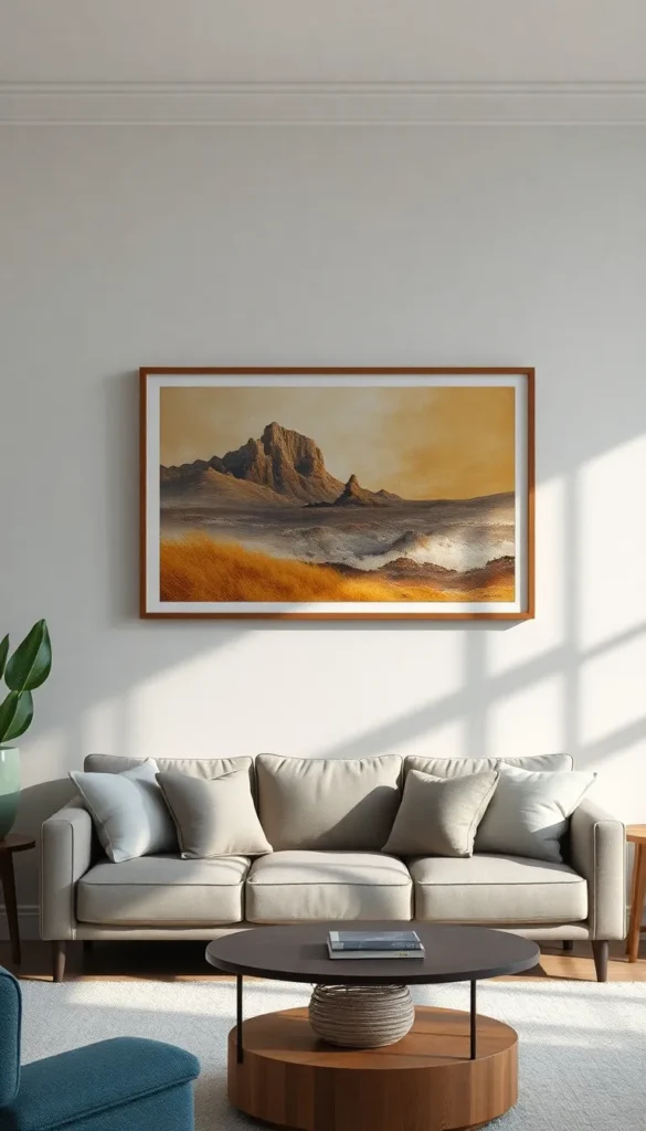
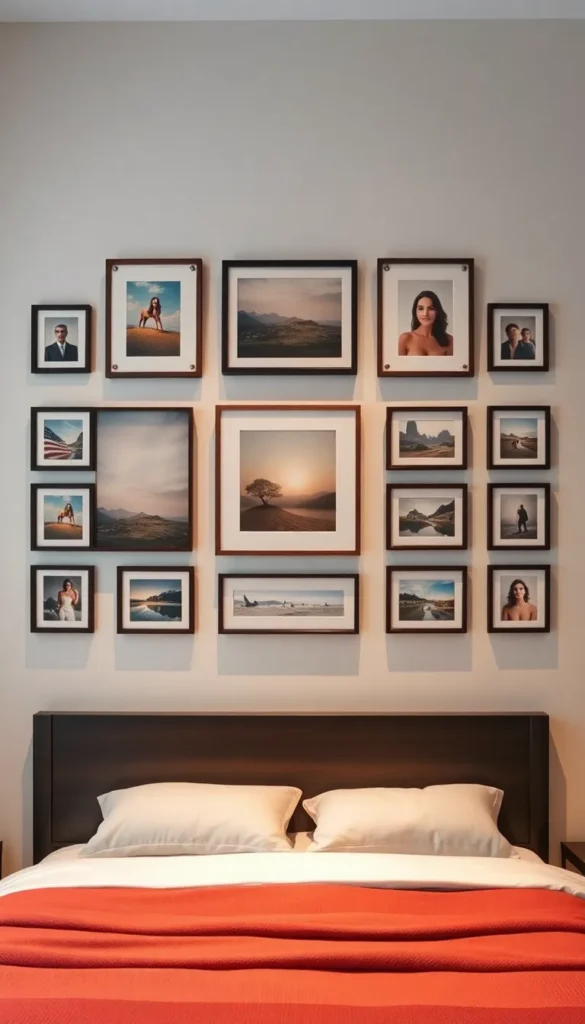
The Golden Rule for Art Above a Sofa or Bed
This is the most common art placement in any home, and it has the clearest formula.
- Your artwork (or art grouping) should be two-thirds to three-quarters the width of the furniture below it
- For a sofa that’s 84 inches wide, look for art roughly 56–63 inches wide
- For a queen bed (about 60 inches wide), aim for art in the 40–48 inch range
- If you’re using a gallery wall instead of one piece, the total width of the grouping should follow the same ratio
This single rule solves probably 80% of “why does this look weird” art placement problems.
How High Should You Hang It?
Width isn’t the only proportion that matters — height plays a huge role too.
- Leave 6 to 12 inches between the top of your furniture and the bottom of the frame
- For furniture-free walls, the center of the artwork should sit at roughly eye level (about 57–60 inches from the floor)
- If you’re hanging multiple pieces, treat the whole grouping as one unit and center that unit at eye level
A piece hung too high feels disconnected from the room; too low, and it can feel cramped or awkward.
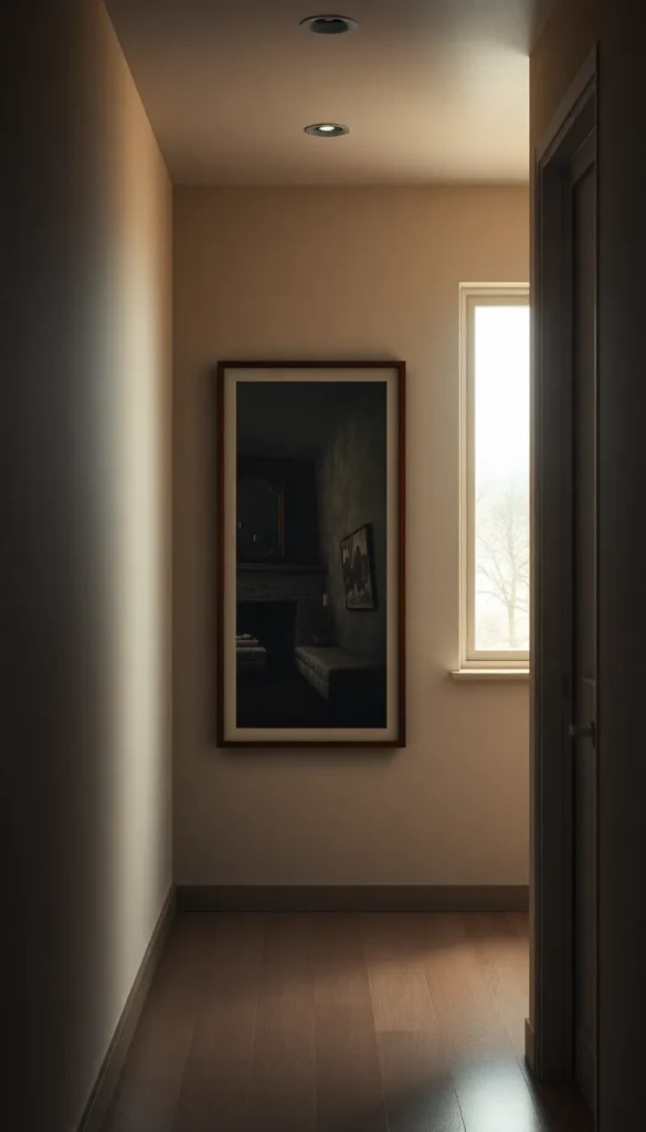
Sizing Art for Empty Walls (No Furniture Below)
Not every wall has a sofa or bed to reference. For open wall space:
- Measure the wall and aim for art that fills 60–75% of the available width
- For a large, blank wall, consider an oversized statement piece rather than several small ones
- Smaller walls (like hallways) do better with narrower, taller pieces
Empty walls are actually the easiest place to go bold — there’s no furniture to compete with.
When (and How) to Build a Gallery Wall Instead
Sometimes one large piece isn’t the answer — and a curated cluster works better, especially over wider furniture.
- Lay out your frames on the floor first to test spacing before hammering anything
- Keep gaps between frames consistent — 2 to 3 inches is the sweet spot
- Mix sizes, but keep a unifying element (same frame color, similar mat width, or a shared color palette)
- Treat the whole arrangement as a single “block” when sizing it against your furniture
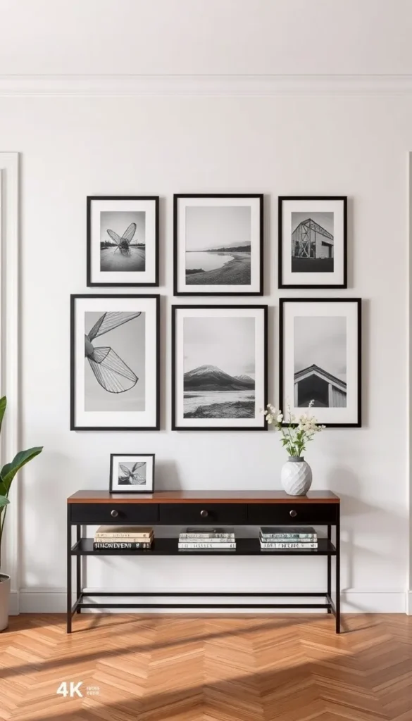
Gallery walls are forgiving because the eye reads them as one shape, not several scattered ones.
Quick Cheat Sheet for Common Furniture
If you want a fast reference without doing math every time:
- Sofa (78–84 in wide): art 52–63 in wide
- Console table (48–60 in wide): art 32–45 in wide
- Queen/king bed: art 40–55 in wide
- Dining table: art roughly two-thirds the table’s length, centered on the wall (not the table)
Keep this list handy next time you’re shopping for a new piece — it takes the guesswork out completely.
Final Thoughts
Choosing artwork isn’t just about finding something beautiful — it’s about finding something that fits. Once you start measuring your furniture first and shopping with those numbers in mind, every piece you hang will feel like it was made for that exact spot.
Loved this guide? Save it now so you always have the perfect art-sizing formula on hand!