Ever walked into a room and felt… nothing? Beige walls, beige couch, beige everything — it’s safe, but it’s also a little sleepy. Here’s the secret every designer swears by: neutrals aren’t boring, they’re a blank canvas. The right accent color is all it takes to turn “fine” into “wow.”
If you’ve ever stared at a paint swatch wall feeling overwhelmed, this guide is for you. Let’s break down exactly how to pick accent colors that make your neutral palette sing.
Start With the Mood You Want to Create
Before you touch a single swatch, ask yourself: what feeling do I want this room to give off?
- Calm and serene? Lean into soft blues, sage green, or muted lavender.
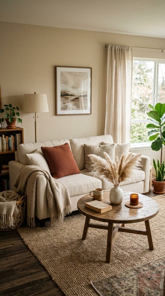
- Cozy and warm? Think terracotta, rust, or mustard.
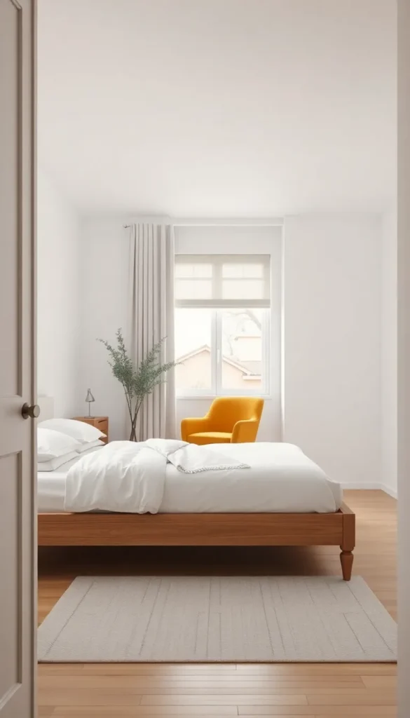
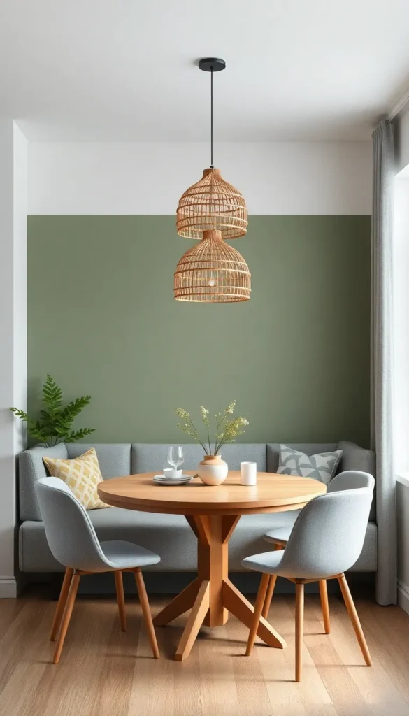
- Bold and modern? Try emerald, navy, or even a deep berry.
Your accent color sets the emotional tone of the whole space, so this step matters more than people think.
Use the 60-30-10 Rule
This is the golden ratio of interior design, and it’s ridiculously simple once you get it:
- 60% — your main neutral (walls, large furniture)
- 30% — a secondary neutral or texture (rugs, curtains)
- 10% — your accent color (pillows, art, vases, throws)
That small 10% packs a surprising punch. It’s enough to draw the eye without overwhelming the calm base you’ve built.
Pull Accent Colors From Nature
When in doubt, nature has already done the color-matching for you. Think about:
- Sand + sky blue — beachy and breezy
- Stone gray + forest green — earthy and grounding
- Cream + dusty rose — soft and romantic
- Warm taupe + burnt orange — autumnal and inviting
These combos feel effortless because they mimic palettes we already find pleasing in the world around us.
Don’t Be Afraid of Contrast
A lot of people choose accent colors that are too close to their neutral, and the room ends up looking flat instead of intentional. The trick is contrast — not necessarily loud, but clear.
- Warm neutral (beige, cream) → cool accent (teal, navy, sage) reads as fresh
- Cool neutral (gray, greige) → warm accent (rust, mustard, coral) reads as cozy
- Light neutral base → one deep, saturated accent creates a focal point instantly
Test Small Before You Commit Big
Never go straight to repainting a wall. Instead:
- Buy a few throw pillows in your top color choices and live with them for a week
- Try a removable accent like a vase, art print, or table runner
- Use paint swatches taped directly onto your wall, and check them in both morning and evening light
Colors shift dramatically depending on lighting, so what looks perfect under store fluorescents might feel totally different in your living room at 7pm.
Repeat the Color in Small Doses
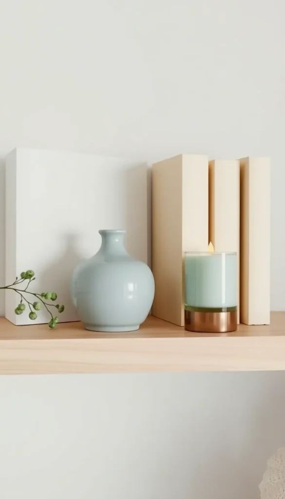
Once you’ve found “the one,” don’t just drop it in a single spot and call it done. Echo it two or three times around the room for balance:
- A throw pillow and a piece of wall art and a candle holder
- A vase and a few book spines and a woven basket trim
This repetition creates a cohesive flow rather than one color feeling like an afterthought.
Quick Accent Color Pairings to Try
If you want a cheat sheet, here are foolproof combos to start with:
- Greige walls + dusty blue accents
- Warm white + terracotta and rust tones
- Soft gray + emerald green
- Linen beige + deep berry or plum
- Cream + black accents for a modern edge
Final Thoughts
Choosing the right accent color isn’t about being bold for the sake of it — it’s about adding just enough personality to make a neutral space feel finished, warm, and yours. Start small, trust contrast over matching, and let one color do the heavy lifting.
Your neutral room has so much potential — it just needs the right pop of color to bring it to life. 💛
Save this post for later so you have it ready next time you’re refreshing a room!