There’s something magical about walking into a room and seeing a wall that tells a story — your story. A personal photo gallery isn’t just decoration; it’s a living scrapbook that turns blank space into something meaningful. Whether you’re working with a huge living room wall or a tiny hallway corner, arranging photos the right way can make any space feel intentional, warm, and completely you.
Start with a Vision (Before You Hammer a Single Nail)
The biggest mistake people make? Going straight to the wall. Slow down and plan first.
Ask yourself:
- What’s the mood? Warm and nostalgic? Clean and modern? Eclectic and bohemian?
- What photos will you use? Family portraits, travel shots, candid moments — or a mix?
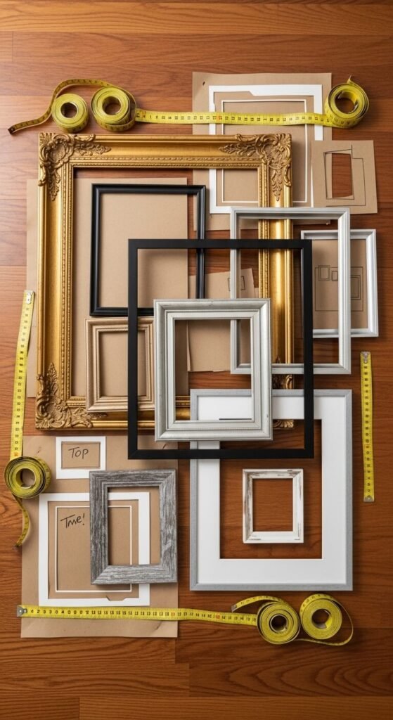
- What’s your frame style? Matching frames look sleek and editorial. Mixed frames feel collected and personal.
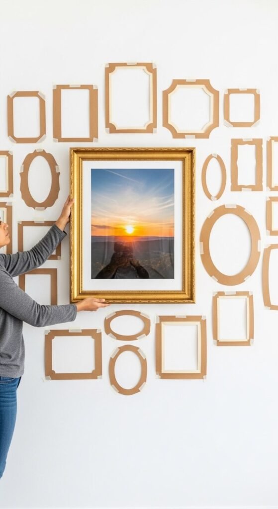
Sketch a rough layout on paper or use painter’s tape on the wall to map out your arrangement before committing. This 10-minute step saves hours of spackle regret.
Choose Your Layout Style
Not all gallery walls are created equal. Pick a format that suits your wall size and personality.
The Grid — Perfect for perfectionists. Evenly spaced frames in rows and columns create a clean, structured look. Best with matching frames and consistent photo sizes.
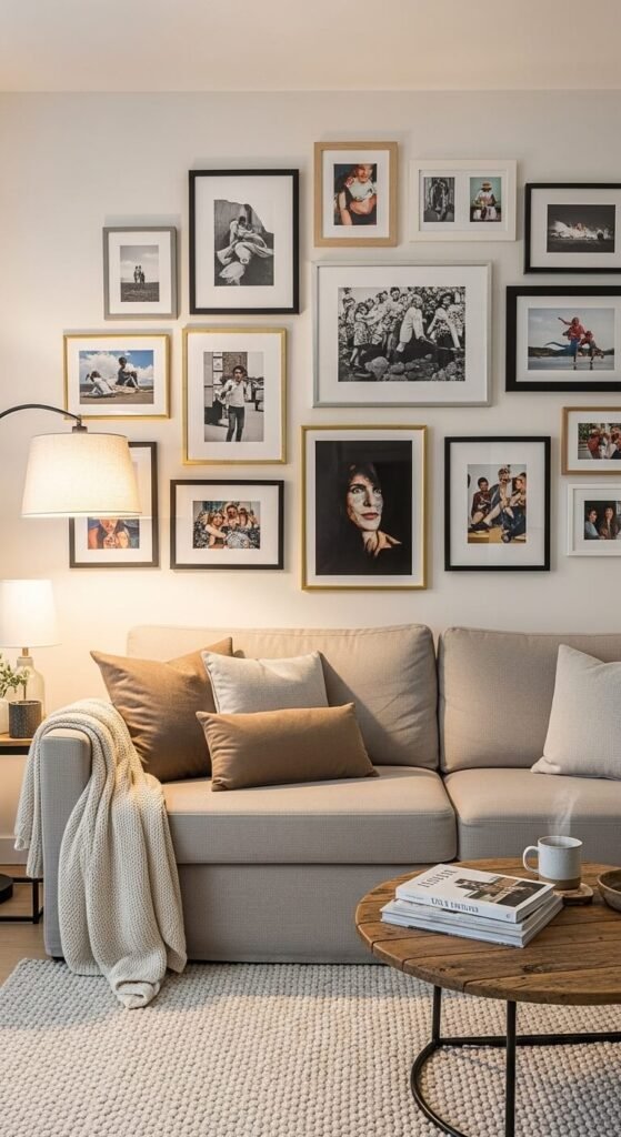
The Salon Style — Frames of all sizes arranged in an organic, edge-to-edge cluster. This is the most popular Pinterest look — layered, rich, and full of personality.
The Horizontal Line — A single row of frames at eye level, ideal for hallways or above a sofa. Simple but striking.
The Asymmetric Story — Photos scattered with breathing room between them, almost floating. Works beautifully in minimalist spaces.
The Golden Rules of Spacing and Height
Even a beautiful collection of photos can look chaotic without a few basic rules:
- Eye level is everything. The center of your gallery should sit at roughly 57–60 inches from the floor — the standard gallery height used in museums.
- Keep gaps consistent. Aim for 2–3 inches of space between frames. Too much space breaks the connection; too little feels crowded.
- Start from the center and work outward. Hang your largest or most important piece first, then build around it.
- Use paper templates. Trace each frame onto kraft paper, cut it out, and tape it to the wall. Rearrange freely until you love it — then nail through the paper.
Mix It Up: Textures, Sizes, and Shapes
A gallery wall that lives is one that breathes variety.
- Vary your frame sizes — combine large statement pieces with small accent frames.
- Mix orientations — alternate portrait and landscape frames to add visual rhythm.
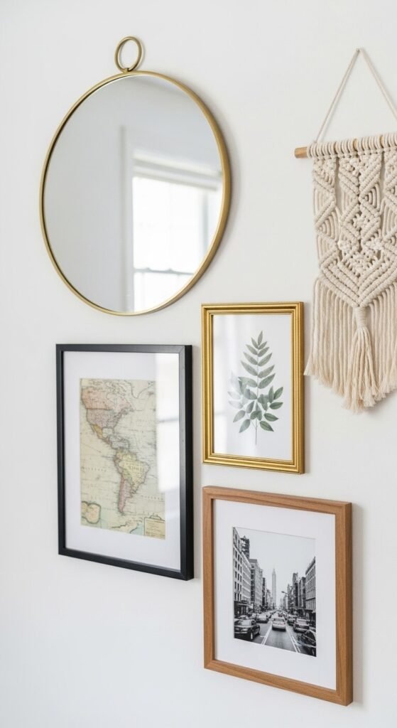
- Add non-photo elements — a small mirror, a woven piece, a pressed botanical print, or a meaningful quote card can break up the photos and add dimension.
- Play with frame finishes — black, gold, natural wood, and white can all coexist when there’s enough repetition to tie them together.
The Final Edit: Step Back and Refine
Once everything is hung, give it a day. Live with it. Look at it in different lighting — morning sun, lamplight, nighttime. Take a photo of it on your phone and study it the way a stranger would.
Ask yourself:
- Does the eye move naturally across the wall?
- Is there a piece that feels out of place?
- Does it feel like you?
Small tweaks — swapping two frames, adding one more small piece, or shifting a photo an inch — can make an enormous difference.
Your Wall, Your Story
A gallery wall done right doesn’t look decorated — it looks lived in. It’s the kind of thing guests stop in front of and want to ask about. Start small if you’re nervous: even three frames arranged thoughtfully above a shelf can have the same effect as a full salon wall.
Save this guide, gather your favorite photos, and start planning your layout today. Your walls are waiting for a story only you can tell. 🖼️