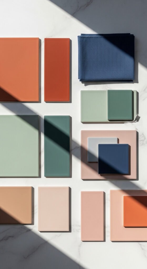
Choosing the right color scheme can completely change how a space feels — or how a design lands. The wrong combination creates visual noise. The right one? It feels like everything just belongs together. Whether you’re painting a room, building a brand palette, or pulling together a wardrobe, color harmony is the quiet force that makes everything look intentional. This list covers 29 tried-and-true color schemes that work across home decor, fashion, graphic design, and art — with simple, affordable ways to use each one in real life.
1. Classic Black and White
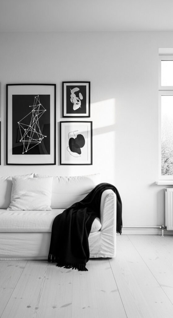
This pairing never goes out of style. Black and white creates sharp contrast and instant sophistication. It works in any room, on any brand, in any wardrobe. The trick is balance — too much black feels heavy, too much white feels cold. Add texture to keep it from looking flat. Think white linen with a black iron bed frame. Or a white wall with black matte picture frames from a dollar store. Affordable and always polished.
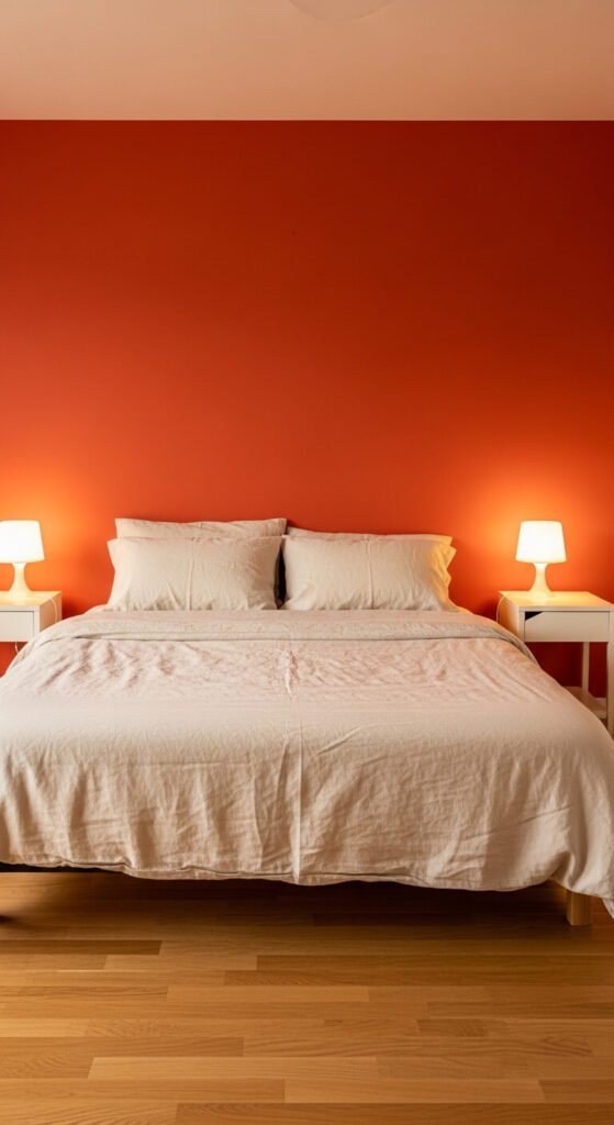
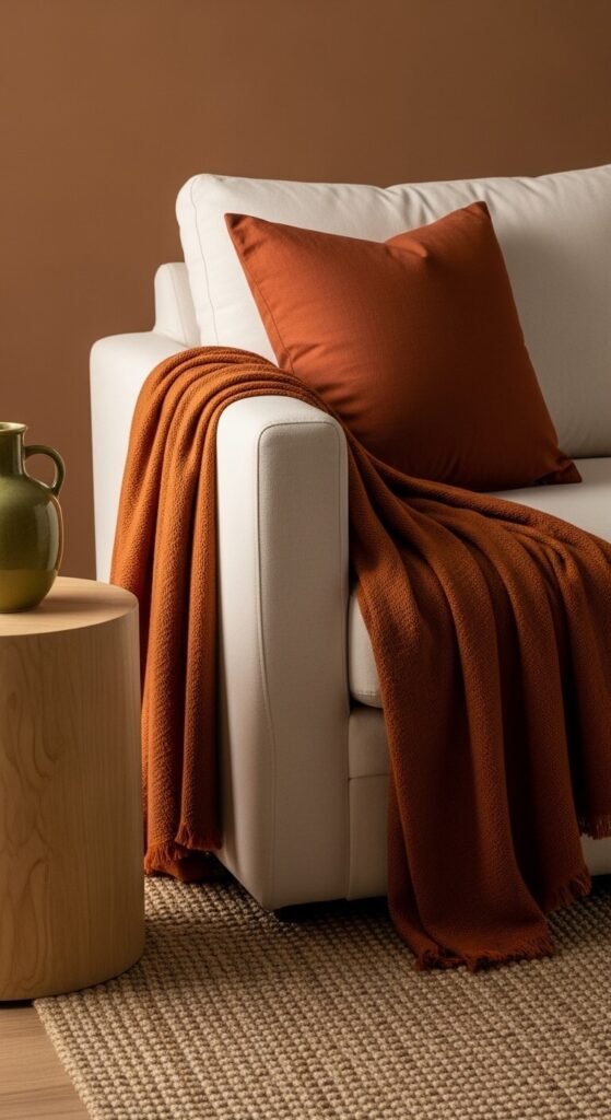
2. Warm Terracotta and Cream
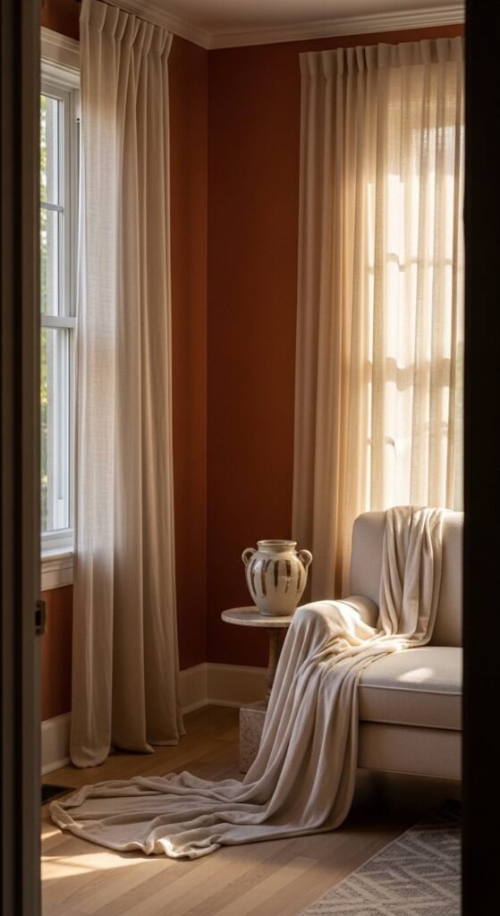
Terracotta and cream is earthy, warm, and grounding. This palette shows up everywhere right now — and for good reason. It feels like a sun-baked Mediterranean home. You can bring it into your space for almost nothing. Paint one wall in a terracotta tone. Use cream cotton bedding. Add a rust-colored throw pillow. Even a single terracotta planter on a cream shelf does the job. It photographs beautifully too, which is a bonus.
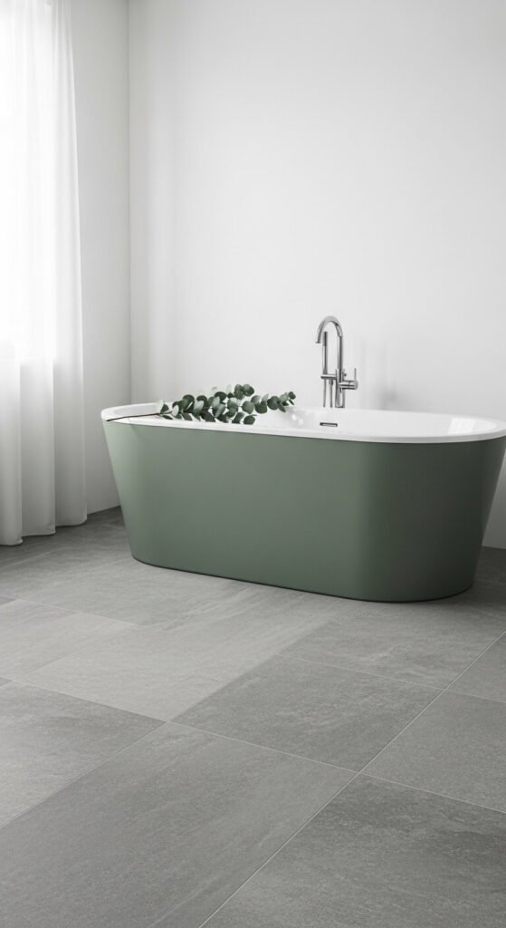
3. Sage Green and Off-White
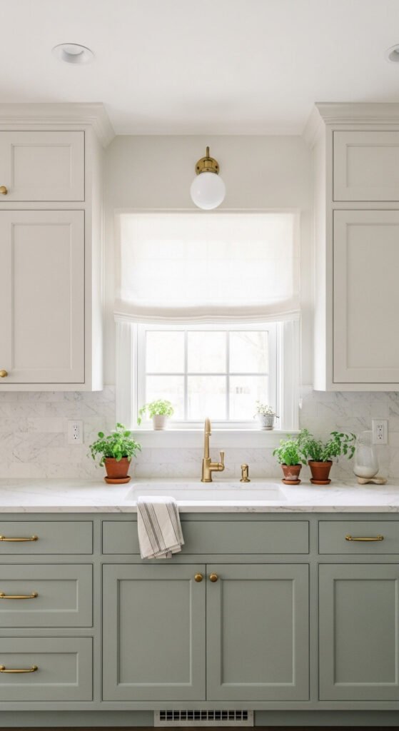
Sage green has become the defining color of calm interiors. Paired with off-white, it reads as soft, natural, and relaxed. It works in kitchens, bedrooms, and bathrooms without feeling trendy or overdone. To try it on a budget, paint a single accent wall sage and keep everything else off-white. Look for sage throw pillows or curtains at discount home stores. Even painting a thrifted side table in sage green makes a big difference.
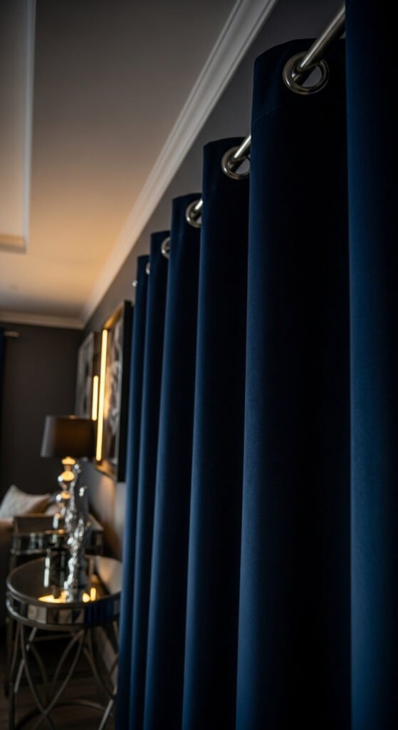
4. Navy Blue and Gold
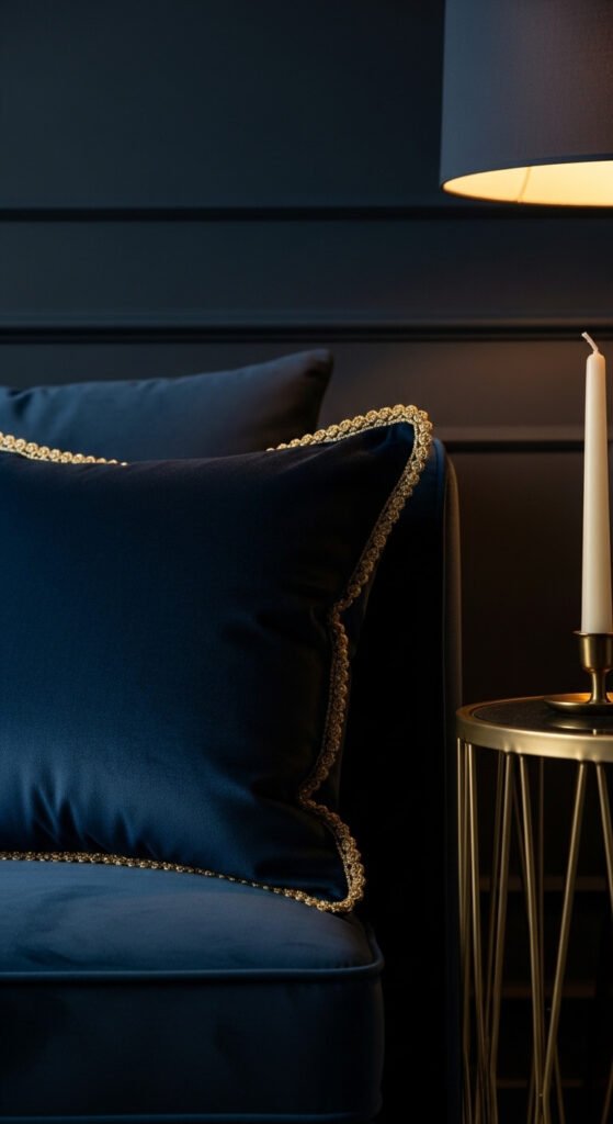
Few pairings feel as confident as navy and gold. This combination reads as structured and elegant without being fussy. It suits bedrooms, home offices, and formal dining spaces. The good news: you don’t need to spend much. A navy wall with brass-toned light switch covers and gold frames creates the whole effect. Look for gold-painted picture frames at thrift stores. Navy spray paint can transform old furniture quickly and cheaply.
5. Dusty Rose and Warm Gray
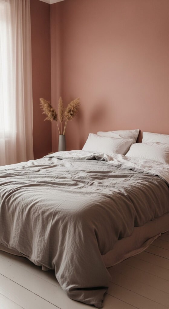
Dusty rose and warm gray is soft without being too sweet. It’s a mature take on pink that works in bedrooms, lounges, and even home offices. The gray keeps the rose grounded. The rose keeps the gray from feeling cold. To try it affordably, use warm gray walls and add dusty rose through cushions, a throw, or even a simple vase. Dried florals in rose tones are budget-friendly and long-lasting.
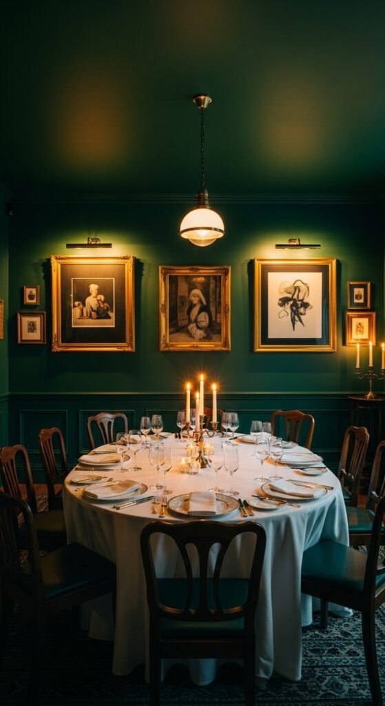
6. Deep Forest Green and Brown

This palette feels like stepping into a cabin library. Deep green and brown is grounding, masculine, and timeless. It works especially well in studies, dining rooms, and entryways. Use brown leather or timber accents against a deep green wall. Even a green throw blanket over a brown sofa does the job. Plants in terracotta pots add both the brown and the green at once — the most affordable way to pull this palette together.
7. Soft Lavender and White
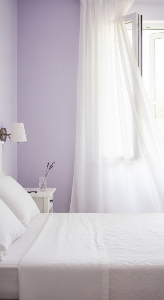
Lavender and white creates a space that feels peaceful and light. It’s especially good in bedrooms and bathrooms where you want a calming atmosphere. This palette doesn’t need much to work. A lavender paint color with white trim is enough. Add white towels, white storage, and a small bunch of dried lavender. It’s one of the most budget-friendly palettes to execute because white basics are always cheap and easy to find.
8. Warm Rust and Mustard Yellow
Rust and mustard is bold, warm, and surprisingly easy to live with. This combo shows up in autumn-inspired interiors and boho spaces. It adds energy without being aggressive. The best part: both colors are everywhere in thrift stores, from mustard yellow curtains to rust-toned ceramic bowls. Try a mustard yellow pillow on a rust-toned sofa or vice versa. Even a mustard blanket thrown over a neutral chair makes this palette feel complete.
9. Teal and Copper
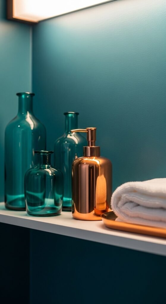
Teal and copper is one of those unexpected pairings that instantly looks curated. The cool depth of teal and the warm glow of copper balance each other out perfectly. This palette works in bathrooms, kitchens, and living rooms. Copper accessories — think soap dispensers, drawer pulls, or candle holders — are widely available and affordable. Pair them against a teal wall or teal-painted furniture for a put-together look that costs very little.
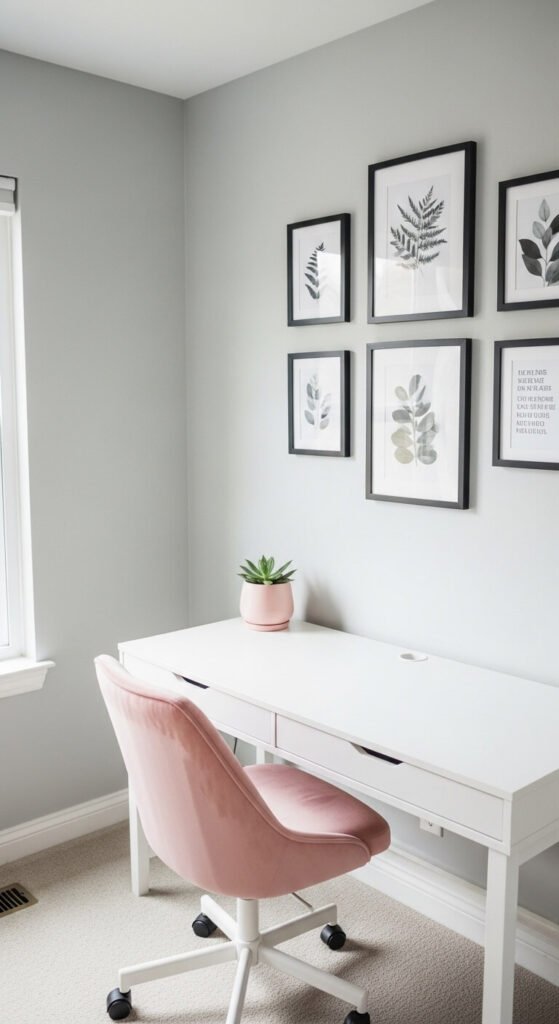
10. Charcoal and Blush Pink
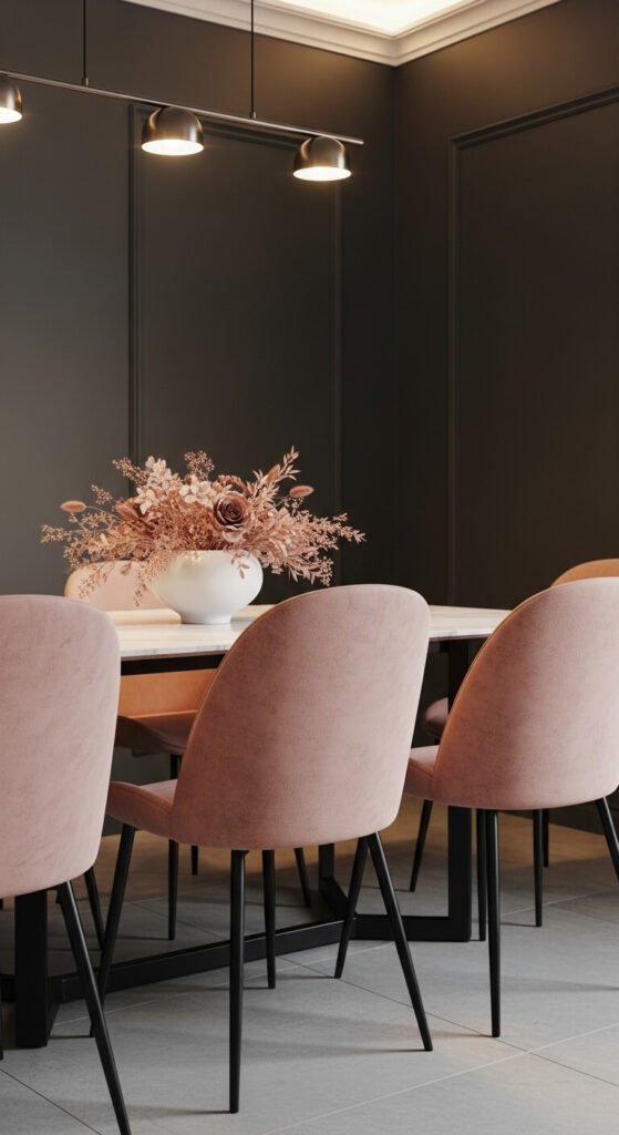
Charcoal and blush is sophisticated and modern. The charcoal adds weight and seriousness. The blush softens it without making it feel too delicate. It’s a natural fit for dining rooms and bedrooms. Try charcoal gray walls with blush linen napkins, throw pillows, or a bedside lampshade. Blush-toned candles are also cheap and widely available. This is a palette that photographs exceptionally well if you ever style your home for photos.
11. Cobalt Blue and Crisp White
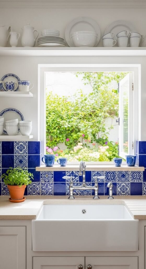
Cobalt blue and white is bold and cheerful. It draws from coastal and Mediterranean design traditions where this combination has been used for centuries. It works particularly well in kitchens and bathrooms. You can bring it in cheaply through cobalt blue dishware or a single printed tile trivet. Even cobalt blue glass bottles styled on a white windowsill creates the mood. This palette needs very little to feel complete and convincing.
12. Warm Peach and Soft Gold
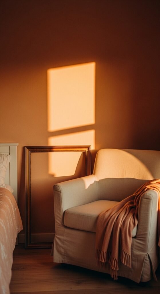
Peach and soft gold creates a glowing, warm-toned palette that’s perfect for bedrooms or lounges. It feels sun-warmed and inviting. This palette layers beautifully without needing many pieces. A peach wall with gold-framed mirrors and warm-toned lighting does most of the work. Look for gold picture frames at thrift stores — they’re almost always available cheaply. Even a peach scented candle in a gold holder adds to the palette without costing much.
13. Midnight Blue and Silver
Midnight blue and silver is dramatic and cool. It suits bedrooms, home bars, and sophisticated entertaining spaces. Silver accessories — mirror frames, candle holders, or decorative trays — are easy to find secondhand. Pair them against a midnight blue backdrop and the effect feels expensive immediately. Even painting an old picture frame silver and hanging it on a navy wall creates the whole palette cheaply. This scheme photographs especially well in low evening light.
14. Warm White and Natural Wood
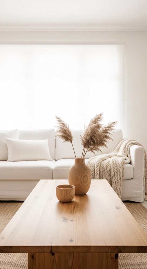
Warm white and natural wood is the backbone of Scandinavian and Japandi design. It’s calming, clean, and easy to build affordably. The key is using warm white rather than stark white — it makes the wood tones glow. Secondhand wooden furniture and white-painted walls are all you really need. Add white linen, white ceramics, and a wooden cutting board styled on the counter. Simple, low-cost, and endlessly livable.
15. Olive Green and Terracotta
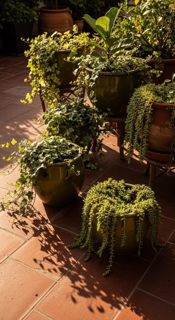
Olive green and terracotta is an earthy, sun-drenched combination. It feels organic and grounded. You see it in Mediterranean gardens and bohemian interiors alike. It’s also one of the easiest palettes to pull off cheaply. Terracotta planters cost almost nothing. Olive green is a common color for discount throws and pillow covers. Plant a few succulents or herbs in terracotta pots and set them against an olive-painted wall for the full effect.
16. Soft Lilac and Butter Yellow
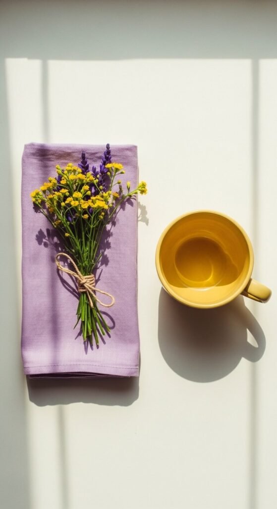
Lilac and butter yellow is joyful and unexpected. It has the energy of a wildflower field. This pairing works in children’s rooms, sunrooms, and creative studios. The key is keeping both tones soft and slightly muted — bright purple and sharp yellow would clash. Look for pale yellow curtains or bedding paired with lilac cushions or wall color. Even a butter yellow throw on a lilac chair creates an instant smile. A cheerful palette that costs very little to try.
17. Stone Gray and Sage
Stone gray and sage is one of the most serene combinations available. Both tones are quiet, natural, and easy to live alongside. This palette works in bathrooms, bedrooms, and kitchens. Gray and sage both work well as wall colors — try one on the walls and use the other in accessories like towels, planters, or cushions. Sage green plants like eucalyptus or rosemary bring the palette to life for almost no money. Simple and sophisticated together.
18. Rich Burgundy and Camel
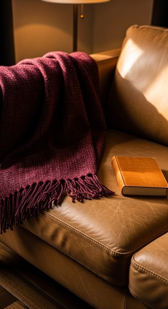
Burgundy and camel feels warm, rich, and grounded. It’s an autumnal palette that works year-round in living rooms and bedrooms. Camel tones — think tan leather, light brown linen — stop burgundy from feeling too heavy or dark. Thrift stores are full of camel-colored items. A burgundy pillow or blanket paired with a camel or tan leather item you already own is all you need. This palette looks far more expensive than it typically costs.
19. Pale Blue and Sandy Beige
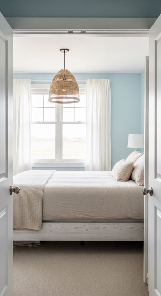
Pale blue and sandy beige captures coastal calm without resorting to clichéd anchor prints. It’s soft, light, and easy to relax in. This palette works in any room — especially bedrooms and bathrooms. Sandy beige linen is widely available and often affordable. Pale blue is a common wall paint choice sold at every hardware store. Pair them together and the result is airy, open, and genuinely relaxing. Add natural textures like rattan and jute to round it out cheaply.
20. Black, White, and Wood
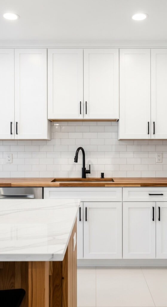
Black, white, and natural wood is the ultimate three-tone combination for modern interiors. The wood stops it from feeling too stark. The black grounds it. The white keeps it breathing. This palette works in kitchens, bathrooms, and living spaces. Swap cabinet hardware to matte black — it’s inexpensive and changes everything. Add a wood cutting board, a wooden bowl, or a small timber shelf. The palette comes together fast and holds up well over time.
21. Burnt Orange and Cream
Burnt orange and cream is warm, bold, and easier to live with than you might expect. The cream balances the intensity of the orange and stops it from feeling too loud. This combination works especially well in bedrooms and living rooms. Try just one burnt orange wall behind your bed or sofa. Keep everything else cream or neutral. Add small burnt orange accents — a candle, a ceramic bowl, a single throw pillow — to tie the whole room together affordably.
22. Dusty Blue and Warm Beige
Dusty blue and warm beige is calm and approachable. It’s a softer alternative to navy and works in almost any room. The beige warms up the blue and stops it from feeling cold or corporate. Dusty blue is a popular paint color — easily affordable. Warm beige linen or cotton basics in bedding or cushions are usually cheap. Together, they create a space that feels thought-through and comfortable without requiring any design expertise.
23. Chocolate Brown and Pastel Pink
Chocolate brown and pastel pink sounds unexpected but works beautifully. It’s grounded and sweet at the same time — think chocolate box packaging done tastefully. This palette suits bedrooms, cafes, and small decorative spaces. A brown leather wallet, belt, or bag pairs surprisingly well with pale pink styling elements. For home use, a chocolate brown throw with pastel pink cushions creates the combination instantly. Both tones are common in thrift stores and discount home sections.
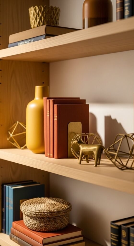
24. Emerald Green and Gold
Emerald green and gold is glamorous and bold. It’s a palette that makes people stop and notice. It suits dining rooms, bathrooms with statement walls, and powder rooms where you want a strong impression. A single emerald green wall with gold-toned accessories is all you need. Hunt for gold picture frames and candleholders at thrift stores — you’ll almost always find them. Pair with white trim and the whole room comes together with just one bold wall color.
25. Light Gray and Blush
Light gray and blush is a modern and professional pairing. It works just as well in a home office as it does in a bedroom or living room. Gray provides a neutral, serious backdrop. Blush adds warmth and personality without being distracting. A blush office chair is often as affordable as a gray one. Add blush candles, a blush desk organizer, or a blush lampshade. Small, cheap additions are all that’s needed to bring this palette to life.
26. Warm Honey and White
Warm honey and white glows. The honey tones — think golden wood, amber glass, straw-colored textiles — light up a white room. This palette is essentially what’s sold in every Scandinavian home store, and for good reason. You likely already have the white elements. Add honey tones through a wooden cutting board, an amber glass vase, or a straw basket. It’s an incredibly affordable palette to build because natural wood and rattan items are always available secondhand.
27. Plum and Pale Gray
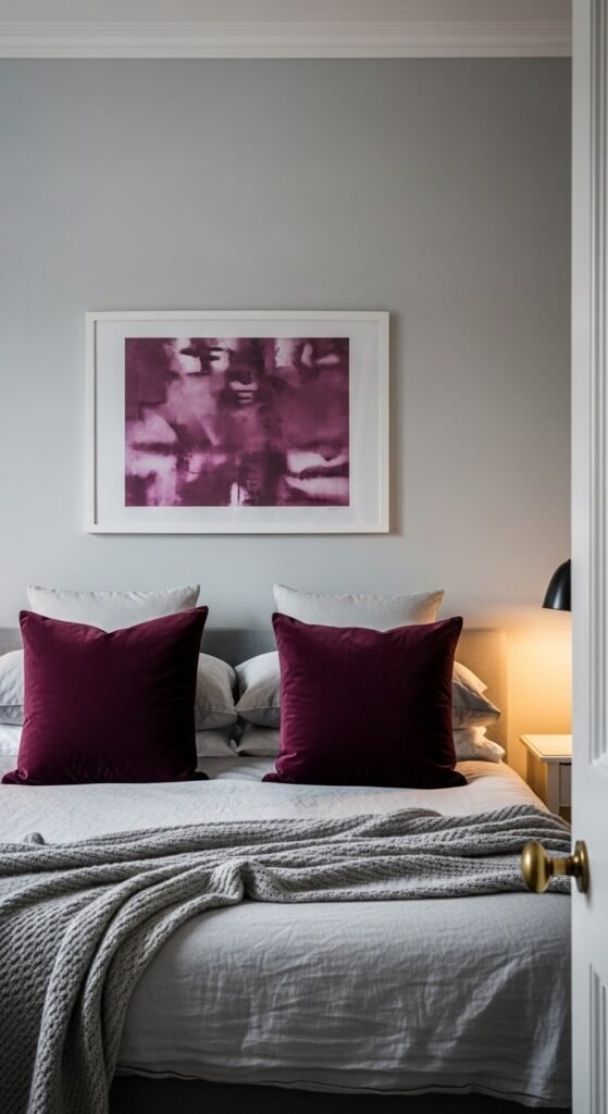
Plum and pale gray is moody and refined. Plum is rich without being as heavy as burgundy or as intense as purple. Pale gray keeps it from feeling overwhelming. This palette suits bedrooms and lounges where you want a cocooning feeling. Plum velvet cushions are widely available at discount home stores. Even a single plum-toned candle or a piece of plum abstract wall art against gray walls establishes the whole scheme. A sophisticated palette that costs very little.
28. Ice Blue and Pure White
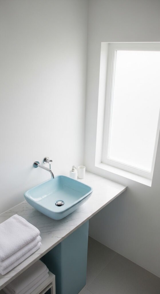
Ice blue and pure white is crisp and clean. It has the feeling of a winter morning — sharp air, bright light. This palette works especially well in bathrooms and laundry rooms where you want a sense of purity and cleanliness. Ice blue towels, a blue glass soap dispenser, or blue-tinted glass bottles arranged on a white shelf are all you need. White paint is always the cheapest option. This palette is as low-cost as it is effective.
29. Rust, Cream, and Olive
Rust, cream, and olive is a three-tone earthy palette that feels natural, warm, and fully formed. It’s the palette of dried grasses, autumn leaves, and sun-baked earth. All three tones are grounding and none of them fight for attention. You can build this palette starting from a cream sofa or neutral walls — the most common starting point. Add a rust throw pillow and a single olive green plant or ceramic. Three items, three tones, completely cohesive. It’s one of the most satisfying palettes to build from scratch affordably.
Conclusion
Color schemes are not about following rigid rules. They’re about finding combinations that feel right to you — and having enough confidence to commit to them. Every palette on this list can be started with just one or two affordable pieces. A throw pillow, a can of paint, a secondhand frame. You don’t need to redo everything at once. Pick the palette that resonates, start small, and build from there. The spaces and designs that feel most cohesive are rarely expensive — they’re just intentional. That’s something anyone can do, at any budget, starting today