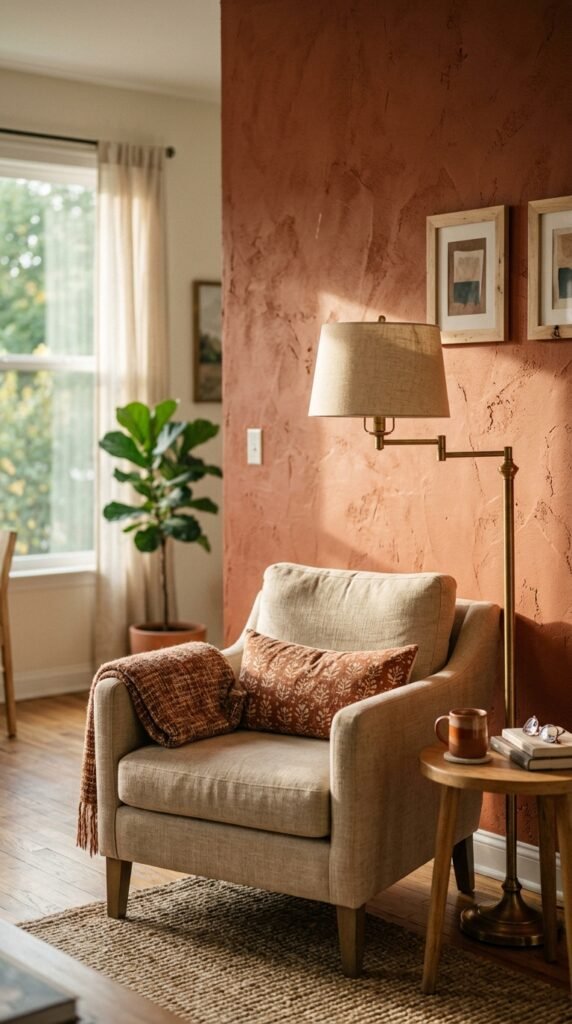
Choosing a paint color can change how a room feels in a single weekend. The right shade makes a small space feel bigger, a dark room feel warmer, or a tired kitchen feel brand new. This year’s trending colors move away from stark white and go toward tones that feel lived-in and personal. Whether you’re working with a can of sample paint or repainting an entire house, these 28 colors give you real direction. Each one comes with practical ways to use it, so you can start your next project with confidence instead of guesswork.
1. Terracotta Clay for Warm Living Rooms
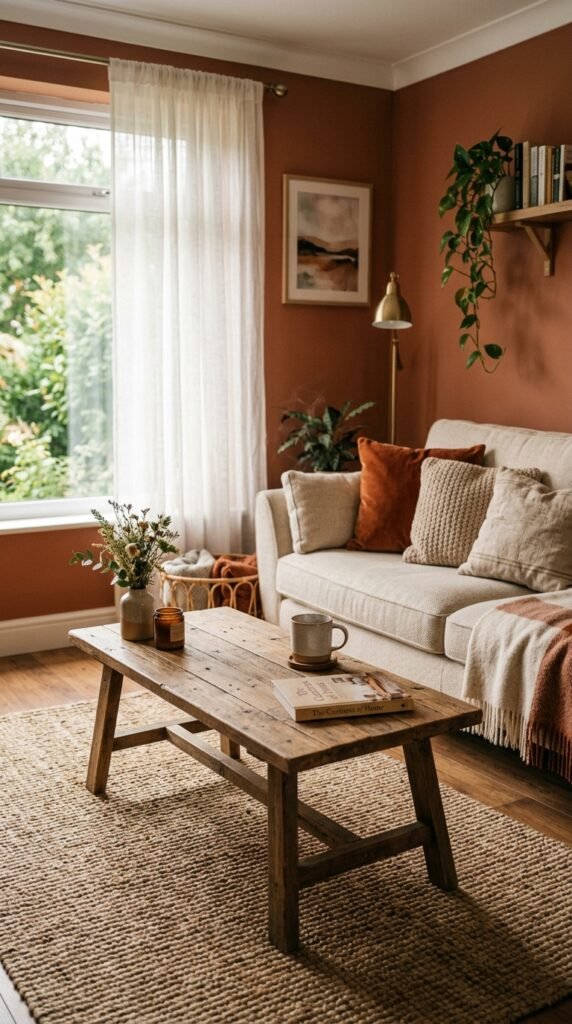
Terracotta clay brings warmth without feeling heavy. It pairs well with wood furniture and green plants. Try it on one accent wall first. A gallon covers most rooms for under $50. Add cream throw pillows to balance the tone. This color works in living rooms with natural light. It also hides scuffs better than white walls. Paint a small swatch first and watch it in morning and evening light. The color shifts throughout the day. This simple test saves you from repainting later.
2. Sage Green for Calm Bedrooms
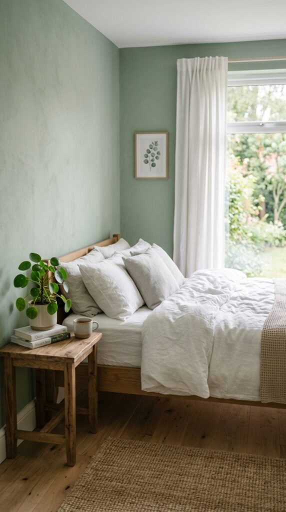
Sage green feels calm and easy on the eyes. It’s a smart pick for bedrooms where you want rest, not energy. Pair it with white trim for contrast. Add wood tones to keep it grounded. A quart of sample paint costs around $10 and covers a small wall. Paint behind your headboard for a simple accent. This color works with both cool and warm lighting. It also pairs nicely with black metal fixtures. Sage green rarely goes out of style, so it’s a safe long-term choice.
3. Butter Yellow for Cheerful Kitchens
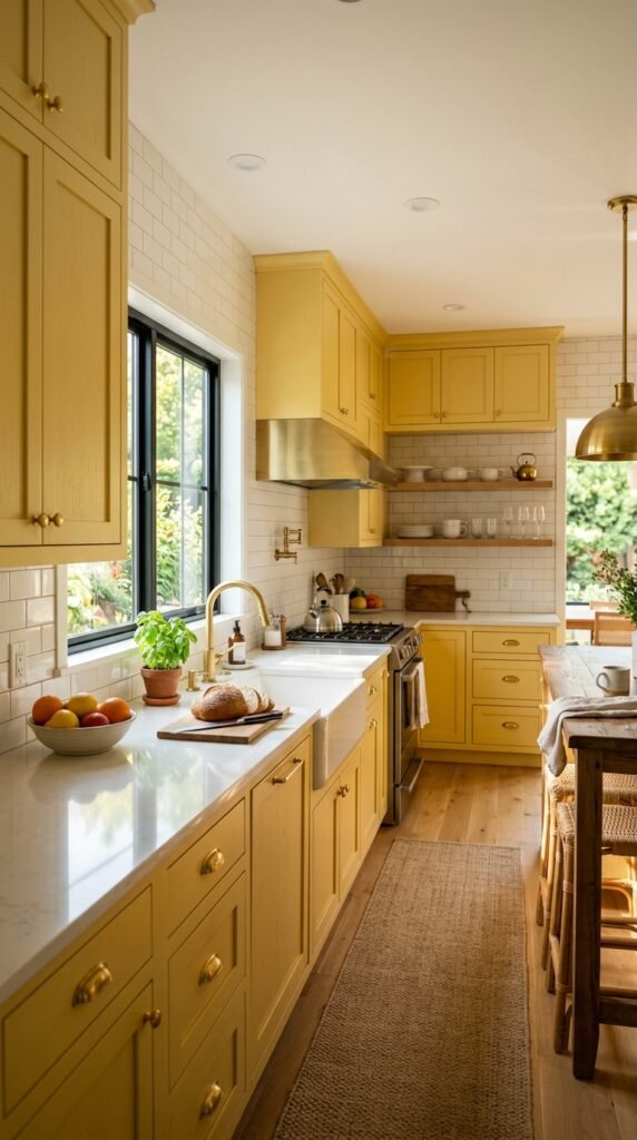
Butter yellow brings a cheerful mood to kitchens. It works well on cabinets or a single wall. Keep countertops white or light gray to balance the color. This shade pairs with brass or gold hardware. Start small by painting just the lower cabinets. A cabinet-sized project can cost under $100 in paint and supplies. Butter yellow photographs well in natural light, which helps if you plan to sell your home later. It also pairs nicely with plants and wood cutting boards for a homey look.
4. Charcoal Gray for Bold Accent Walls
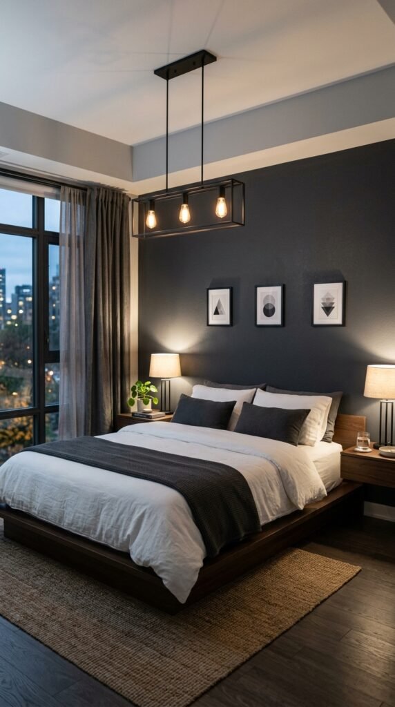
Charcoal gray adds depth without going full black. It works best as a single accent wall. Pair it with white bedding or furniture to keep the room from feeling dark. This color hides marks well, which makes it practical for hallways too. A gallon runs about $40 and covers most accent walls. Add a mirror across from the wall to bounce light back into the room. Charcoal gray also pairs well with gold or brass frames for a simple upgrade.
5. Dusty Blue for Relaxing Bathrooms
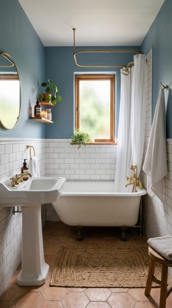
Dusty blue feels calm and spa-like. It works in small bathrooms where you want a relaxing mood. Pair it with white tile and simple chrome fixtures. This color hides water splashes better than pure white. A quart is often enough for a small bathroom, costing around $12. Add a woven bath mat and wood accessories to soften the space. Dusty blue also works well with brass faucets for contrast. This is an easy weekend project that changes the whole feel of the room.
6. Warm Taupe for Open Concept Homes
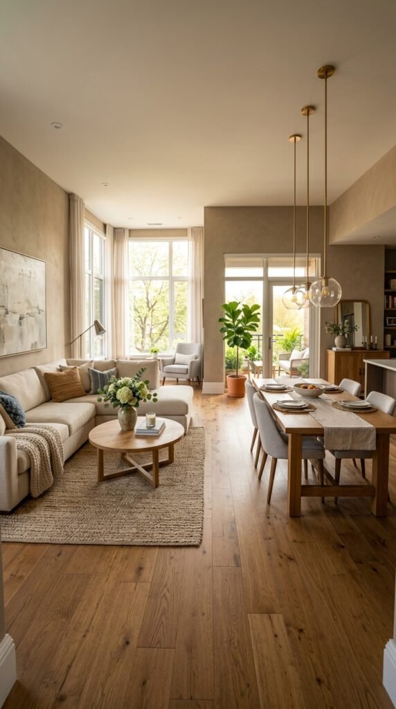
Warm taupe works well when one color needs to flow through multiple rooms. It reads as neutral but still feels warm. This shade pairs with both black and wood furniture. It’s a practical choice for renters who want something safer than bold colors. A five-gallon bucket can cover an entire open floor plan for around $150. Test it in different rooms since lighting changes how it looks. Warm taupe also works as a backdrop for colorful art or textiles.
7. Deep Forest Green for Home Offices
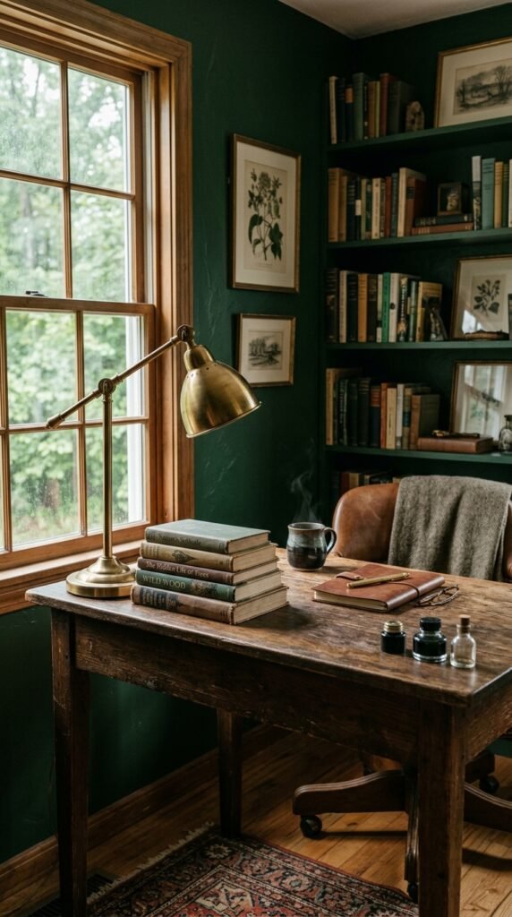
Deep forest green creates a focused mood for home offices. It works well in smaller rooms where you spend short periods of time. Pair it with wood furniture and brass accents. This color can feel dramatic, so try it on just one wall first. A quart sample covers a small test area for about $10. Add a simple gallery wall in gold frames to complete the look. Deep forest green also pairs well with cream curtains if the room gets a lot of light.
8. Blush Pink for Soft Nurseries
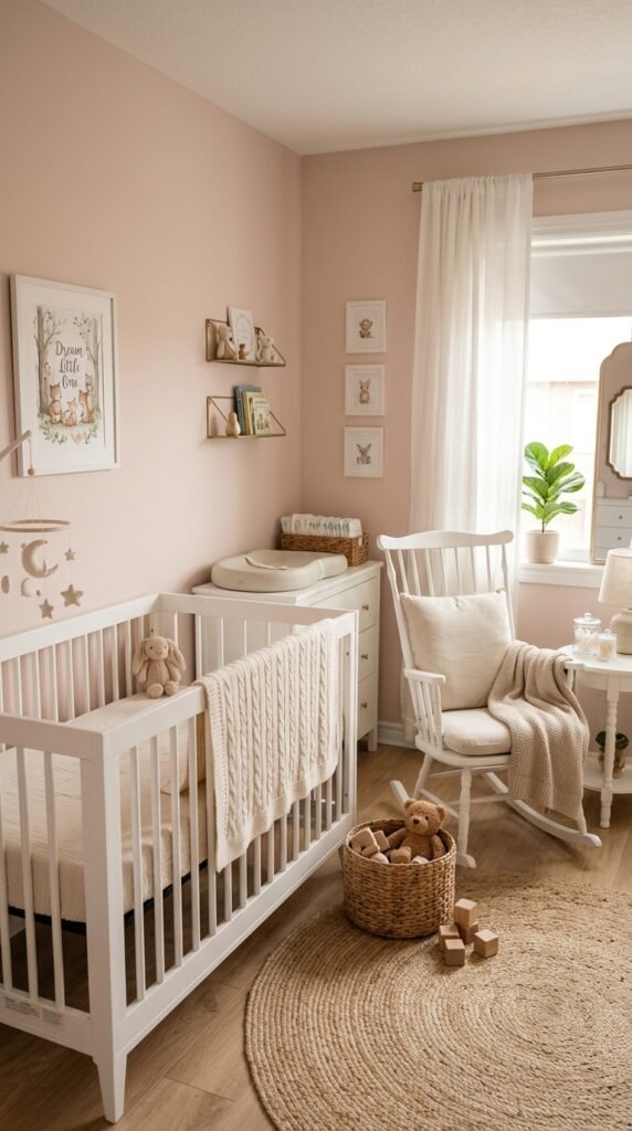
Blush pink feels soft without being too sweet. It works well in nurseries or reading nooks. Pair it with white furniture and natural wood toys. This color is easy to update later with removable decor instead of full walls. A quart is usually enough for an accent wall, costing about $10. Add sheer curtains to keep the light soft. Blush pink also pairs nicely with brass mobile hooks or simple wall art for a finished look without much cost.
9. Navy Blue for Classic Dining Rooms
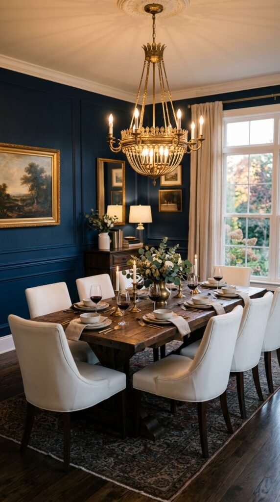
Navy blue gives dining rooms a classic, put-together look. It pairs well with wood tables and brass lighting. This color works in rooms used mostly at night since it looks rich under warm bulbs. A gallon covers most dining rooms for around $45. Add white chairs to keep the room from feeling too dark. Navy also pairs well with gold frames or mirrors. This is a good choice if you want a dramatic look without repainting the entire house.
10. Warm White for Small Apartments
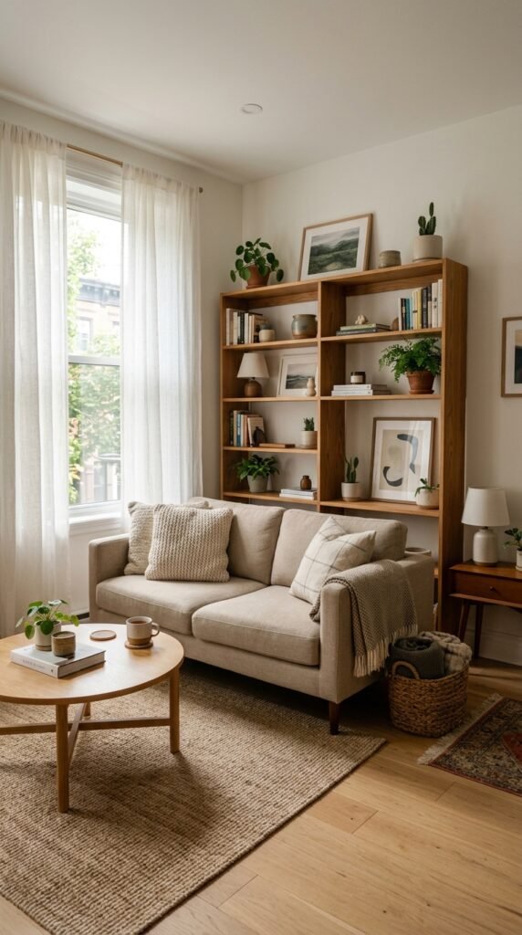
Warm white makes small apartments feel bigger and brighter. It’s softer than stark white and pairs with almost any furniture color. This shade works well for renters who need a safe, neutral option. A gallon covers an average apartment room for about $35. Add texture through pillows, rugs, and plants since the walls stay simple. Warm white also photographs well for listing photos if you plan to sublet or sell later. It’s a low-risk, high-payoff choice for small spaces.
11. Mustard Yellow for Cozy Reading Nooks
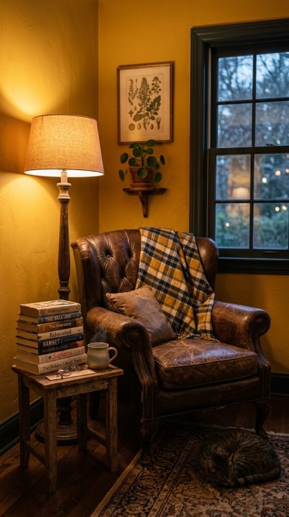
Mustard yellow adds warmth to a small corner of the house. It works well in reading nooks or hallway alcoves. Pair it with leather furniture and warm-toned lamps. This color feels cozy at night under soft bulbs. A quart sample is enough for a small nook, costing around $10. Add a wool throw blanket for texture. Mustard yellow also pairs well with navy or forest green accents if you want to add more color later.
12. Soft Gray-Green for Modern Kitchens
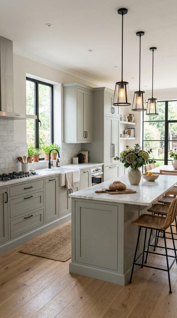
Soft gray-green feels calm and modern in kitchens. It pairs well with white countertops and black hardware. This color reads as neutral, so it works with most kitchen styles. Start with just the lower cabinets to test the look before committing. A cabinet paint kit runs about $80 and includes primer. Add black or brass pulls for contrast. Soft gray-green also works well with open wood shelving if you want a mixed material look in the space.
13. Rust Orange for Statement Entryways
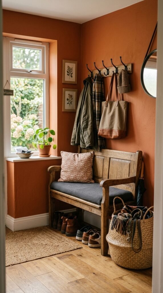
Rust orange makes a strong first impression in an entryway. It works well in small spaces since you pass through quickly. Pair it with wood furniture and woven baskets for storage. This color hides scuffs from shoes and bags better than lighter shades. A quart covers most entryways for about $10. Add hooks and a small bench to keep the space practical. Rust orange also pairs well with black metal fixtures for a simple, grounded look.
14. Pale Lavender for Calm Home Offices
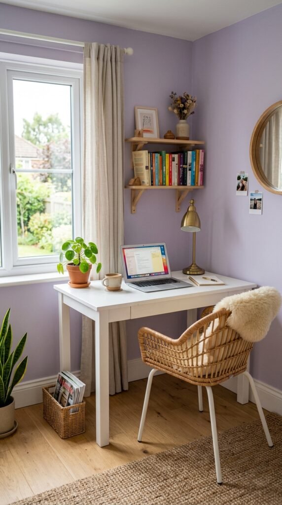
Pale lavender feels calm without being too soft. It works well in home offices where you want focus without feeling cold. Pair it with white furniture and simple wood accents. This color works in rooms with lower natural light since it doesn’t feel heavy. A quart sample is enough for a small office wall, about $10. Add a woven chair for texture. Pale lavender also pairs well with brass desk accessories for a simple, put-together look.
15. Olive Green for Earthy Living Rooms
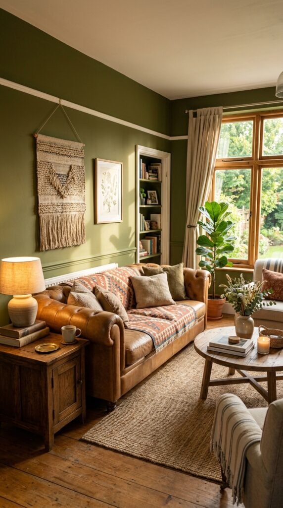
Olive green brings an earthy, grounded feel to living rooms. It pairs well with tan leather and wood furniture. This color works in rooms with a lot of plants since the tones complement each other. A gallon covers most living rooms for around $45. Add woven textiles like baskets or throw blankets for texture. Olive green also pairs well with brass lighting fixtures. This is a good option if you want a color that feels natural and calm.
16. Warm Terracotta Pink for Cozy Bedrooms
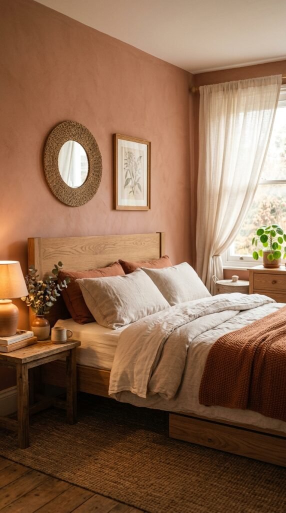
Warm terracotta pink feels cozy and a little unexpected. It works well in bedrooms where you want warmth without going bold. Pair it with linen bedding and wood furniture. This color looks different depending on the time of day, so test a sample first. A quart costs about $10 and covers a small accent wall. Add woven baskets or rattan accents to complete the look. Warm terracotta pink also pairs well with brass hardware on nightstands or dressers.
17. Deep Teal for Dramatic Powder Rooms
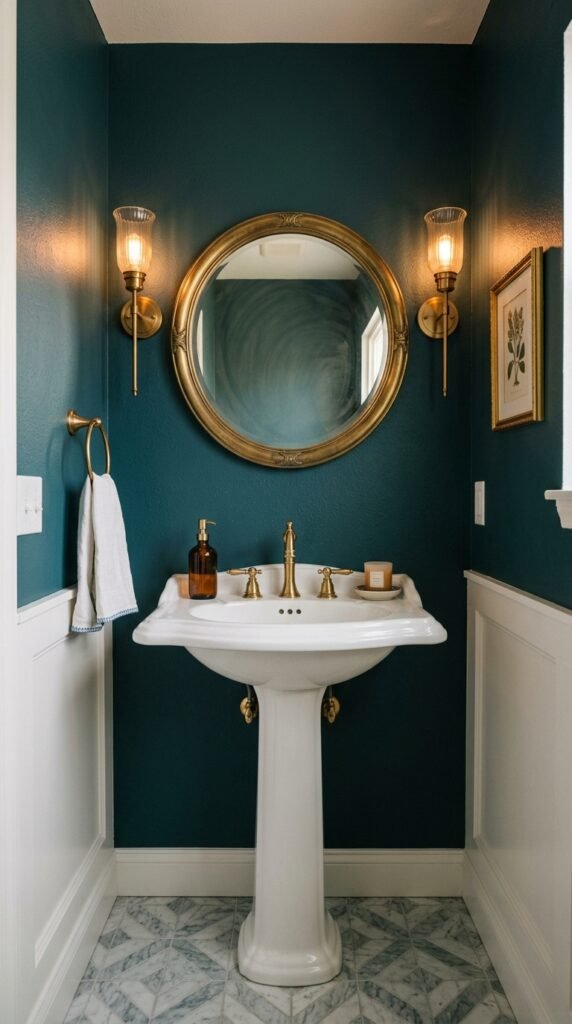
Deep teal works well in small rooms like powder rooms where a bold color won’t overwhelm the whole house. Pair it with brass fixtures and a simple pedestal sink. This color feels rich under warm lighting. A quart is usually enough for a small bathroom, costing around $12. Add a round mirror to bounce light around the space. Deep teal also pairs well with white tile floors for contrast. This is a low-cost way to add drama without repainting a large room.
18. Soft Peach for Warm Kitchens
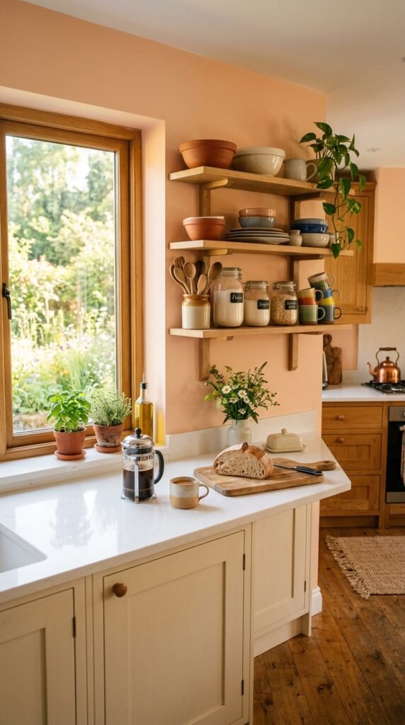
Soft peach adds warmth to kitchens without feeling too bright. It pairs well with wood shelving and white countertops. This color works well in kitchens that get a lot of morning light. Start with a single wall to test the shade before committing further. A quart sample costs about $10. Add copper pots or wood cutting boards to bring out the warm tones. Soft peach also pairs well with sage green accents if you want to add a second color later.
19. Chocolate Brown for Rich Dining Rooms
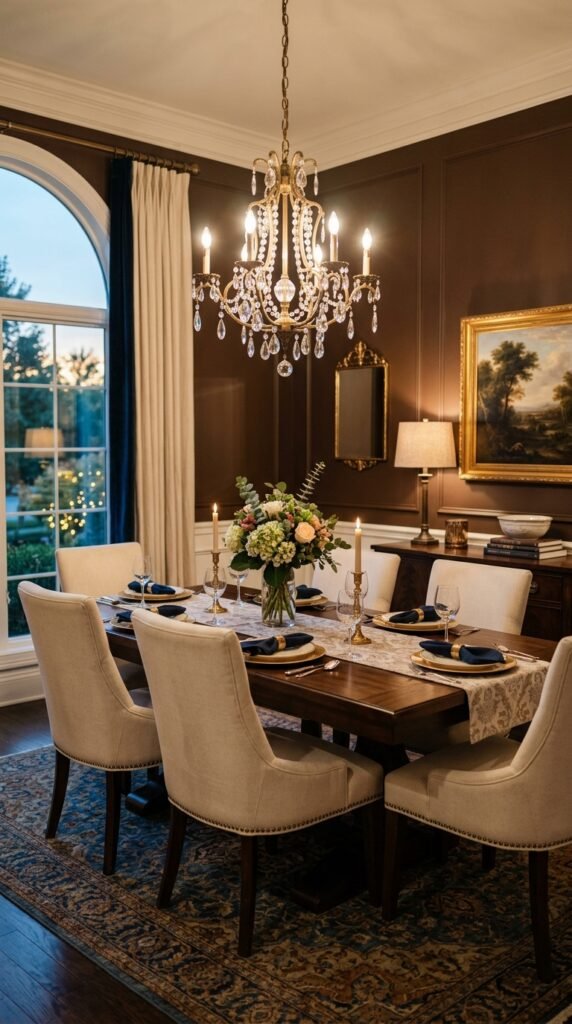
Chocolate brown gives dining rooms a rich, grounded feel. It pairs well with cream chairs and brass lighting. This color works best in rooms used mainly in the evening since it looks warm under soft bulbs. A gallon covers most dining rooms for around $45. Add cream or white linens to balance the dark walls. Chocolate brown also pairs well with gold picture frames. This color choice works well if you want a formal, put-together dining space.
20. Soft Sky Blue for Airy Bedrooms
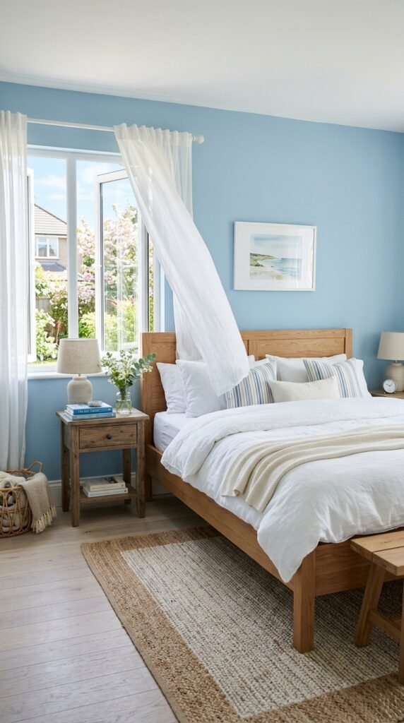
Soft sky blue keeps bedrooms feeling light and airy. It pairs well with white bedding and natural wood furniture. This color works well in rooms with lots of windows since it reflects natural light nicely. A gallon covers most bedrooms for about $40. Add sheer curtains to keep the room feeling open. Soft sky blue also pairs well with woven baskets for storage. This is a simple, low-cost way to make a bedroom feel calm and bright.
21. Warm Camel for Cozy Hallways
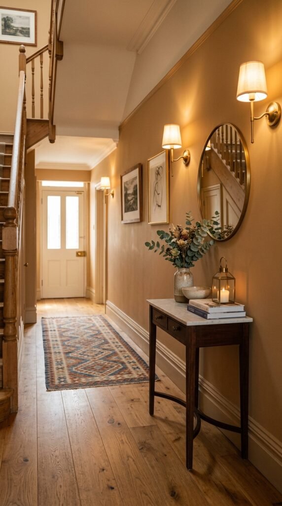
Warm camel works well in hallways since it feels cozy without being too dark. It pairs well with wood flooring and simple sconces. This color hides scuffs and marks better than lighter shades, which matters in high-traffic areas. A gallon covers most hallways for around $40. Add a small console table and mirror to make the space feel finished. Warm camel also pairs well with black or brass light fixtures. This is a practical choice for busy parts of the house.
22. Muted Rose for Feminine Bathrooms
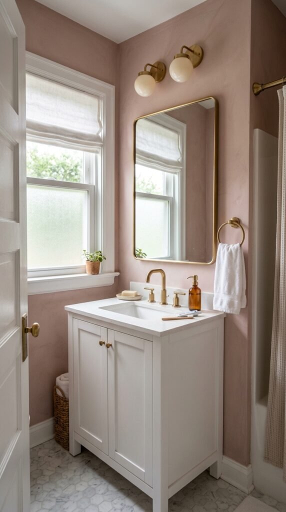
Muted rose brings a soft, feminine touch to bathrooms. It pairs well with white vanities and brass fixtures. This color works in small spaces since it doesn’t overwhelm the room. A quart is usually enough for a small bathroom, costing about $12. Add a woven basket for towels to soften the look further. Muted rose also pairs well with gold-framed mirrors. This is an easy way to update a bathroom without replacing tile or fixtures.
23. Slate Blue for Focused Home Offices
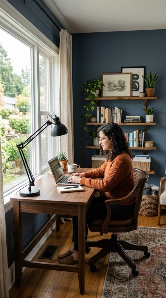
Slate blue feels focused and calm, which makes it a good fit for home offices. It pairs well with wood desks and black accents. This color works in rooms with moderate natural light since it doesn’t feel too dark. A quart sample covers a small office wall for about $10. Add simple black shelving to keep the room organized. Slate blue also pairs well with brass desk accessories. This color choice supports a workspace that feels calm and productive.
24. Warm Ivory for Traditional Living Rooms
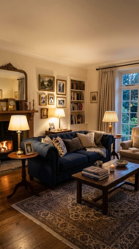
Warm ivory gives living rooms a traditional, timeless look. It pairs well with tufted furniture and wood accents. This color works as a safe base if you like to change decor often. A gallon covers most living rooms for around $40. Add patterned pillows or a patterned rug for personality. Warm ivory also pairs well with brass lamps and mirrors. This is a solid pick if you want a room that ages well and works with changing trends.
25. Deep Plum for Bold Bedrooms
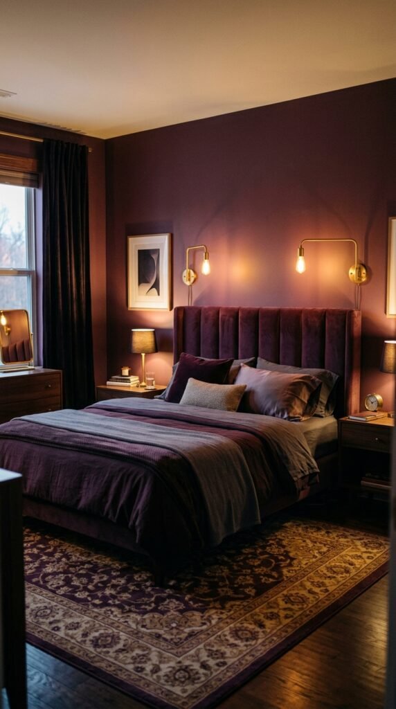
Deep plum adds drama to bedrooms without going as dark as black. It pairs well with velvet furniture and brass lighting. This color works best as an accent wall behind the bed. A quart sample covers a small test area for about $10. Add warm lamp lighting to bring out the richness of the color at night. Deep plum also pairs well with gold picture frames. This is a good option if you want a bedroom that feels cozy and a little luxurious.
26. Soft Moss Green for Nature-Inspired Bathrooms
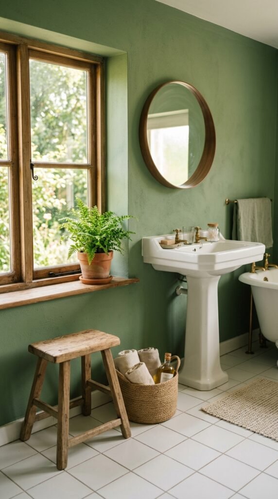
Soft moss green brings a nature-inspired feel to bathrooms. It pairs well with white tile and wood accents like a small stool or shelf. This color works well with plants, since the tones complement each other naturally. A quart is enough for most bathrooms, costing around $12. Add a small fern or potted plant to complete the look. Soft moss green also pairs well with black fixtures for contrast. This is a simple way to bring the outdoors into a small space.
27. Warm Gray for Versatile Family Rooms
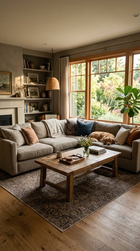
Warm gray works well in family rooms because it pairs with almost any furniture color. It reads as neutral but still has some warmth compared to cooler grays. A gallon covers most family rooms for around $40. This color hides everyday marks and scuffs well, which matters in high-use rooms. Add colorful pillows or a patterned rug to bring in personality. Warm gray also pairs well with both wood and black furniture. This is a practical, long-lasting choice for busy households.
28. Antique White for Timeless Trim and Ceilings
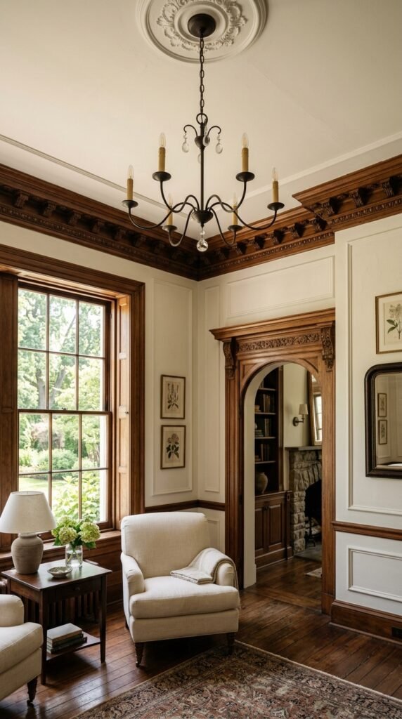
Antique white works well for trim, ceilings, and doors when paired with a bolder wall color. It’s softer than stark white, which keeps rooms feeling warm instead of clinical. A quart often covers trim in an average room for about $12. This color helps other paint choices stand out without competing for attention. Add it to crown molding or baseboards for a finished look. Antique white also pairs well with almost any wall color, making it a safe, low-cost update.
Conclusion
Picking a paint color doesn’t have to be complicated or expensive. Each shade on this list can be tested with a small sample can before committing to a full room. Start with one wall, one piece of furniture, or one small space, and build from there. Small budget changes like these make a real difference in how a home feels day to day. Pick a color that matches your space and lighting, grab a sample, and start painting this weekend.