
Your walls tell your story, but blank spaces say nothing. A gallery wall transforms empty surfaces into personal museums that reflect who you are. Whether you’re working with family photos, thrift store finds, or printable art, the right layout makes all the difference. These 27 arrangements work in any space and with any budget, helping you create a display that feels authentically you.
The Classic Grid

Line up frames in rows and columns for foolproof symmetry. Use identical frame sizes and consistent spacing—about 2-3 inches between each piece works well.
This layout loves matching frames from dollar stores or IKEA. Measure and mark your wall with painter’s tape before hanging. Print family photos at the same size, or download free printables online. The uniform look makes mixed content feel pulled together. Works perfectly above sofas or beds where you want visual calm.
The Salon Style
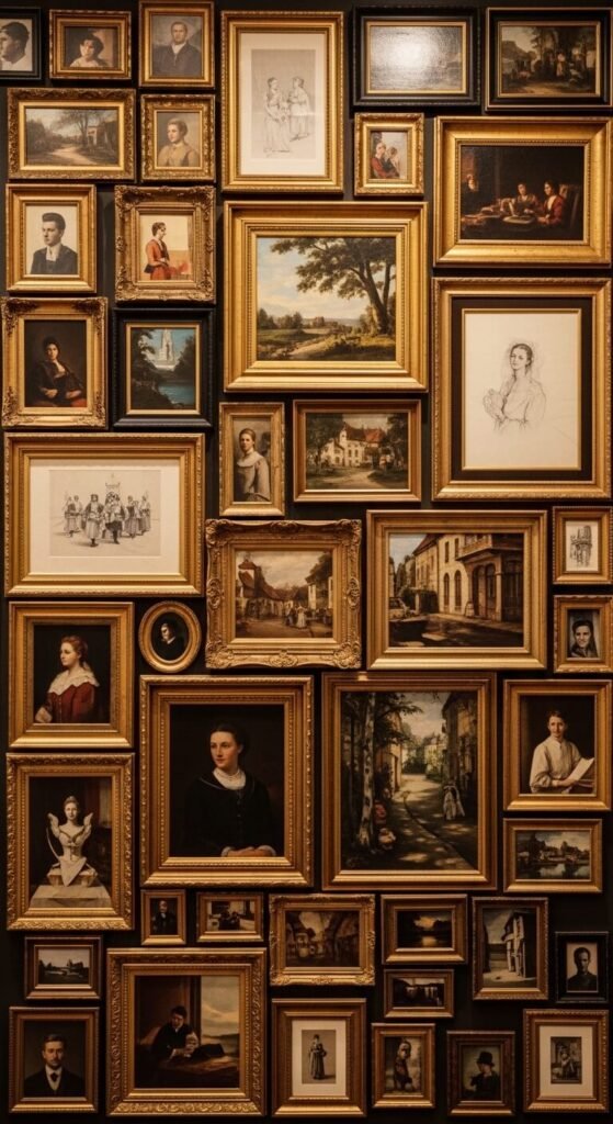
Pack your wall with frames of all sizes, overlapping edges until barely any wall shows through. Start with your largest piece in the center and build outward.
Thrift stores are goldmines for mismatched frames. Spray paint them one color if you want cohesion. Lay everything on the floor first to plan spacing. Hang the center piece at eye level, then fill gaps with smaller items. This maximalist approach hides wall imperfections and lets you display dozens of memories without planning every inch.
The Horizontal Line

Create one straight line of frames at the same height. Match the tops or bottoms of each frame for clean alignment.
Use a level and pencil to mark your line before hanging. Three to seven frames works best. Mix frame sizes but keep them the same color for consistency. This works great in hallways or above furniture. Print your own photos at Walgreens or Costco for under $10. The linear arrangement makes small spaces feel wider.
The Corner Display

Wrap your gallery around a corner to use awkward spaces. Treat both walls as one continuous canvas.
Start at the corner with a medium-sized frame, then extend outward on both sides. This turns dead corners into focal points. Use command strips if you’re renting. Mix your own artwork with magazine pages or book illustrations. The wraparound effect makes rooms feel more connected and uses every inch of wall space.
The Staircase Climb

Follow your staircase angle with frames that step up alongside the stairs. Keep consistent spacing from the handrail.
Measure 5-7 inches from the handrail for each frame placement. Start at the bottom with your favorite piece. This dead space becomes storytelling territory—perfect for family timelines or vacation memories. Hardware stores sell picture hanging kits for under $5. The diagonal draws eyes upward and makes staircases feel intentional.
The Oversized Statement

Hang one giant piece and call it done. Sometimes less says more.
Find oversized prints at places like HomeGoods or print engineering blueprints at FedEx for cheap. A large piece costs the same as several small frames but makes bigger impact. Lean it against the wall if hanging feels intimidating. This works when you want drama without complexity. One strong image beats a dozen weak ones.
The Scattered Organic
Arrange frames loosely without strict patterns. Trust your eye for balance rather than measurements.
Lay frames on the floor and play with placement until it feels right. Take a photo and reference it while hanging. This casual approach looks collected and personal. Mix frame styles from different eras. Use 3M strips to adjust as you go. The imperfect spacing makes everything feel authentic, like you’ve gathered these pieces over years.
The Vertical Stack

Stack frames in a single column to emphasize height. Works perfectly in narrow spaces between windows or doors.
Three to five frames looks best. Keep them the same width but vary heights slightly. This draws eyes up and makes low ceilings feel taller. Thrift stores often have sets of matching frames for a few dollars. Hang the center frame at eye level first, then add above and below. Great for slim walls where horizontal arrangements won’t fit.
The Symmetrical Twin

Mirror identical arrangements on both sides of a central point like a fireplace or window.
Buy two of everything—frames, mats, and prints. This formal approach suits traditional spaces. Measure carefully to match spacing on both sides. You can find matching print sets on Etsy or print the same image twice. The symmetry creates calm and makes architectural features feel grounded.
The Leaning Shelf

Skip the nails and lean frames on picture ledges or floating shelves.
Install simple IKEA picture ledges for under $10. Layer frames by size, overlapping edges. This lets you switch things out whenever you want without new holes. Mix in small plants or candles between frames. Frames from dollar stores work great since they’re just leaning. The casual vibe suits renters and commitment-phobes.
The Shaped Arrangement

Arrange frames to create shapes—hearts, circles, or even your initials.
Draw your shape lightly in pencil first. Fill the outline with frames of varying sizes. This playful approach works in kids’ rooms or creative spaces. Use templates you find free on Pinterest. The whimsical result makes plain walls feel personal and fun without professional help.
The Mixed Media Wall
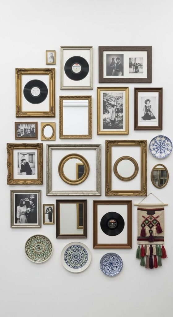
Combine framed art with objects like mirrors, plates, or macrame.
Hang frames first, then fill gaps with 3D items. Thrift stores have cheap vintage mirrors and decorative plates. This adds depth and texture beyond flat images. Mix your grandma’s china with your concert photos. The varied surfaces catch light differently and make walls more interesting than photos alone.
The Color Story

Choose frames and art that share the same color family.
Pick 2-3 colors and stick with them. Print free art from Unsplash in your chosen palette. Paint mismatched thrift frames the same color. This creates cohesion even when mixing different subjects and styles. Your eye sees the color connection first, making random pieces feel curated.
The Black and White Classic

Use only black and white photos in black frames for timeless simplicity.
Convert color photos to black and white for free in your phone. This removes color decision stress. Black frames are cheapest at craft stores with coupons. The restrained palette looks expensive and professional. Mix old family photos with new ones—the monochrome makes everything match. Works in any room style from modern to traditional.
The Floor-to-Ceiling Drama

Cover an entire wall, top to bottom, with frames.
Start in the middle and work outward and upward. You’ll use dozens of frames, so buy cheap ones. This makes small rooms feel grand and empty rooms feel full. Collect frames over time and add gradually. The complete coverage turns your wall into wallpaper made of memories.
The Floating Frames

Use frameless clips or acrylic frames for modern, minimal look.
Buy clipboards and hang them as instant frames for under $2 each. Or get acrylic frames from Amazon. The see-through effect feels fresh and lets your wall color show through. Perfect for modern spaces where traditional frames feel heavy. Easy to swap art since there’s no frame to open.
The Ledge Layers

Install multiple shelves at different heights and layer frames on each level.
Use 2-3 shelves spaced about 18 inches apart. This creates depth and lets you display way more than wall-hanging allows. Shelves hold other objects too—books, plants, candles. Change your display seasonally without tools. The dimensional approach beats flat walls.
The Archway Frame

Create an arch shape above furniture like beds or sofas.
Use painter’s tape to mark your arch first. Largest frames go at the base, smallest at the top. This soft shape feels welcoming and draws attention to furniture below. Download arch templates online for free. The curved line softens boxy rooms and adds architectural interest.
The Off-Center Cluster

Group frames tightly in one section, leaving the rest of the wall empty.
Hang 3-7 frames close together, touching or nearly touching. The negative space makes your cluster look intentional, not unfinished. This works in modern spaces that embrace asymmetry. You spend less on frames but get maximum impact. The empty space lets your wall breathe.
The Timeline Story

Arrange photos chronologically to tell a story across your wall.
Start with oldest on the left, newest on the right. Great for family histories, relationship milestones, or kids growing up. Add dates beneath photos with vinyl letters or handwritten tags. This turns your wall into a visual timeline people can follow. Budget-friendly since you’re using photos you already have.
The Polaroid Grid

Use clips, string, or cork boards to display instant photos or prints.
String twine across your wall and clip photos with mini clothespins. Or mount a large cork board and pin away. This lets you add and remove photos constantly. Print phone photos as 4x6s for under 20 cents each. The changeable nature keeps your wall current with your life.
The Window Frame Gallery

Repurpose old windows with multiple panes as ready-made frames.
Find windows at salvage yards or garage sales. Clean them up and insert photos behind each pane. The divided glass creates instant structure. You can also buy new window-style frames at craft stores. The architectural element adds character while organizing your photos automatically.
The Matching Mat Gallery

Use identical mats in different frame sizes for pulled-together look.
Buy pre-cut mats at craft stores or cut your own from mat board. Same mat color makes mismatched frames look intentional. This trick makes cheap frames look expensive. The white space around each image gives eyes room to rest. Your art looks gallery-ready even if frames came from yard sales.
The Ledge and Hang Combo

Combine hanging frames with shelf-leaning pieces at different heights.
Mount a shelf at chest height. Hang frames above it and lean frames on it. This mix adds dimension and flexibility. The shelf breaks up the wall and gives you options. Place small plants or objects between leaning frames. Half your pieces need hanging, half don’t—easier and faster.
The Statement Wall Behind Furniture

Create a gallery wall specifically behind your sofa or bed.
Keep the arrangement slightly narrower than your furniture width. Start hanging about 6-8 inches above the furniture. This anchors your seating area and fills awkward wall space. The furniture frames the bottom of your gallery naturally. Use frames that complement your furniture finish.
The Triple Cluster

Create three separate small groupings across one wall instead of one big cluster.
Space your mini-galleries evenly. Each group tells its own story. This approach suits long walls where one massive gallery feels overwhelming. Keep spacing between clusters equal to frame spacing within clusters. Use threes for visual rhythm. Each section can have its own theme while feeling related.
Conclusion
Your gallery wall doesn’t require perfect spacing or expensive frames. Start with what you have, add what you find, and arrange pieces until they feel right. The best layouts reflect your actual life—your photos, your budget, your style. Hang that first frame today. You can always adjust, add more, or start over. Your walls are waiting to tell your story.