Neutral decor has a quiet kind of power. It doesn’t shout. It holds the room together without asking for attention. The best neutral palettes aren’t boring — they’re deliberate. They age gracefully, photograph beautifully, and never fight with the seasons. Whether you’re starting a room from scratch or slowly shifting the feel of a space you already have, the right neutral palette gives you a foundation that simply works. These 25 picks are rooted in the three things that separate a flat, forgettable beige room from one that genuinely stops people mid-step: texture, undertone, and layering.
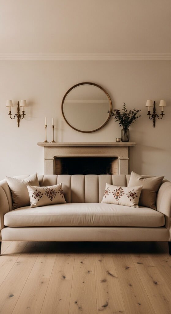
1. Warm Greige and Natural Oak
Greige — the perfect middle ground between grey and beige — is one of the most livable neutrals ever created. It reads warm in daylight and slightly cooler at night. Pair it with natural oak for an instantly grounded result. Think raw shelving, simple frames, or a sanded side table. Budget tip: Paint one wall in Sherwin-Williams “Accessible Beige” and add a $15 thrifted oak frame. The palette builds itself from there.
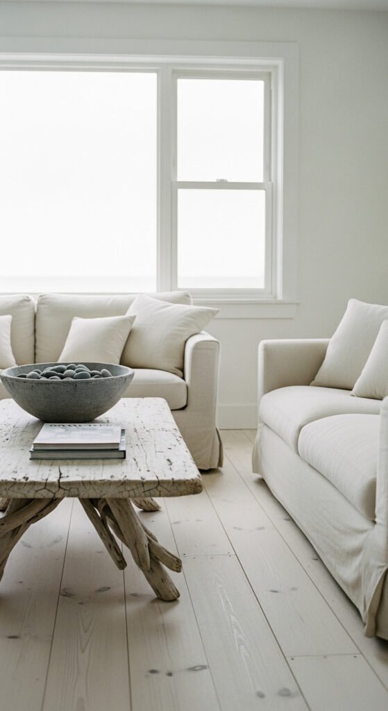
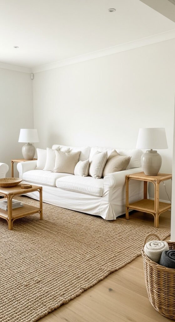
2. Soft White and Aged Linen Layering
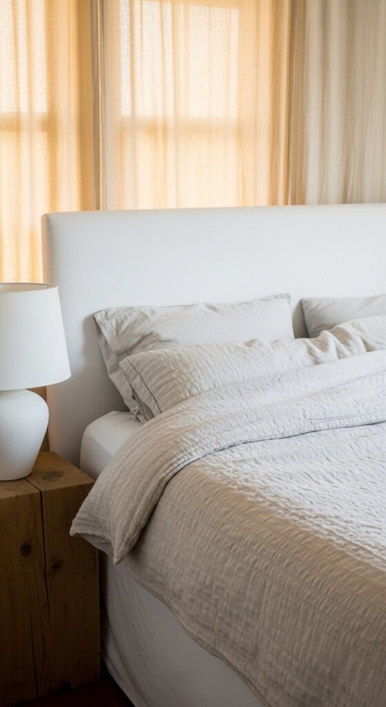
This palette works by layering whites that aren’t quite the same shade. Bright white walls against aged linen bedding create instant depth — without a single bold choice. Use different textures within the same colour family: cotton, linen, and waffle weave all in cream tones. It feels expensive without being expensive. DIY tip: Wash white cotton pillowcases with a tablespoon of tea for a gentle aged tone. Costs almost nothing and looks completely intentional.
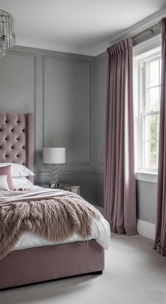
3. Putty and Plaster Pink
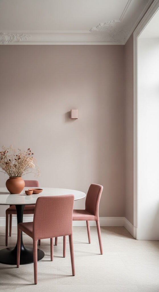
Plaster pink sits so close to neutral that most people won’t register it as pink at all. In certain lights it reads almost like a warm white. Paired with putty tones and natural stone, it creates a palette that feels ancient and modern at once. Budget tip: Farrow & Ball “Setting Plaster” is the gold standard, but most hardware stores mix near-identical dupes. Ask for a custom match and save considerably without sacrificing the effect.
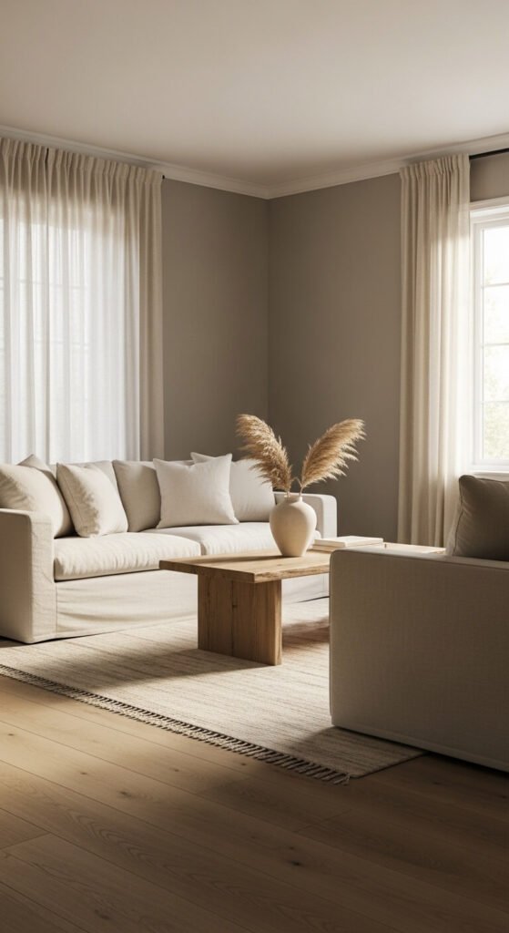
4. Slate Grey With Warm Undertones
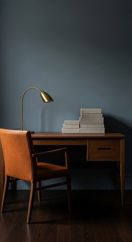
Cool greys fail when there’s no warmth beneath them. Slate grey with a brown or purple undertone stays alive in a room rather than going flat. It pairs brilliantly with cognac leather, aged brass, and dark walnut. This palette suits home offices and living rooms that want some visual weight. Budget tip: Always test grey paint chips against your existing furniture before committing. Grey changes more dramatically than any other neutral depending on the light source in your room.
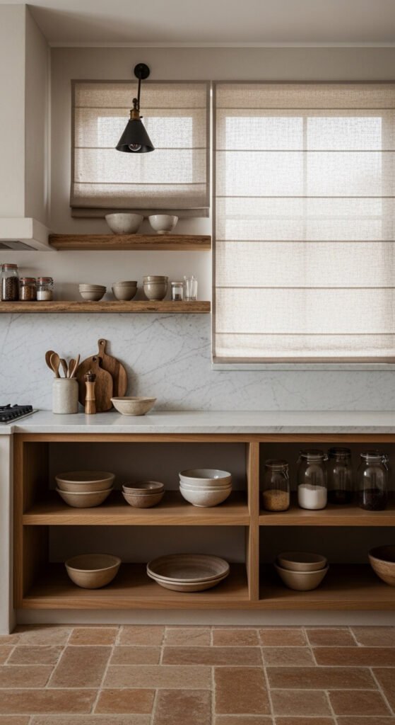
5. Warm Cream and Beeswax
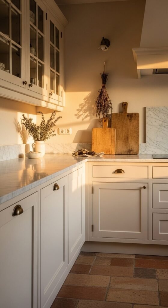
Cream and beeswax are the coziest neutrals in the spectrum. They bring warmth without tipping into yellow. This palette works especially well in kitchens and breakfast nooks where you want the space to feel nourishing. Aged brass hardware echoes the golden undertone in both shades perfectly. Budget tip: Swap out cabinet handles for aged brass pulls from Etsy or Amazon for under $30 total. It shifts the entire palette without touching a single wall.
6. Raw Concrete and Stone
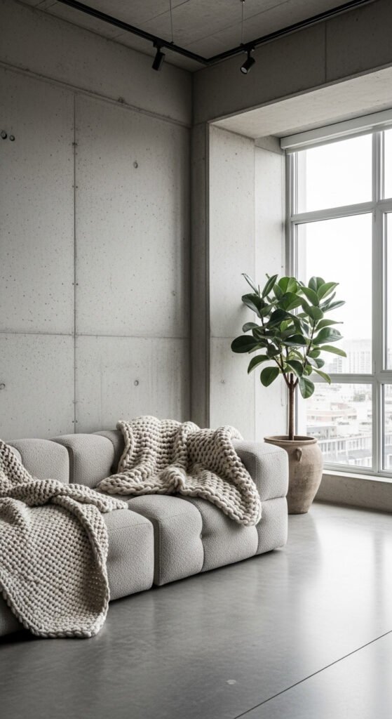
Concrete and stone feel contemporary but are built on materials that have existed for centuries. That’s why this palette never ages. The key is softening it with organic textiles — chunky knit throws, linen curtains, and woven baskets prevent it from reading as cold. Budget tip: Concrete-effect paint is widely available and costs a fraction of real poured concrete. Apply with a sponge in uneven layers for a natural, mottled result. A weekend project with genuinely striking impact.
7. Driftwood and Sand
This palette captures coastal living without resorting to anchors or shell motifs. Driftwood grey paired with sandy beige comes directly from nature — which is why it always feels right. Use unbleached cotton, natural rope accents, and smooth stone objects as your decorative language. Budget tip: Real driftwood collected from a beach or riverbank makes the most authentic and completely free centrepiece. Sand it lightly, seal with matte varnish, and it belongs immediately.
8. Ivory and Antique Brass
Ivory walls with antique brass fixtures is one of the most quietly luxurious combinations available. It echoes old European interiors — the kind that look assembled slowly over decades rather than all at once. The trick is scale. Use one large brass element rather than five small ones. Budget tip: A $6 can of aged brass spray paint can transform a thrift store mirror or lamp into something that looks genuinely collected and considered. The finish is the thing.
9. Mushroom and Taupe Gradient
Mushroom and taupe are close cousins. Layering them in one room creates tonal depth that feels sophisticated rather than monotonous — but only when you vary texture rather than colour. Velvet, linen, and wool all in the same mushroom-taupe family look rich and considered together. Budget tip: Buy fabric remnants from a local upholstery shop in tonal neutrals. Cut into cushion covers or drape over chairs as throws. Looks curated. Costs almost nothing.
10. Chalk White and Raw Wood
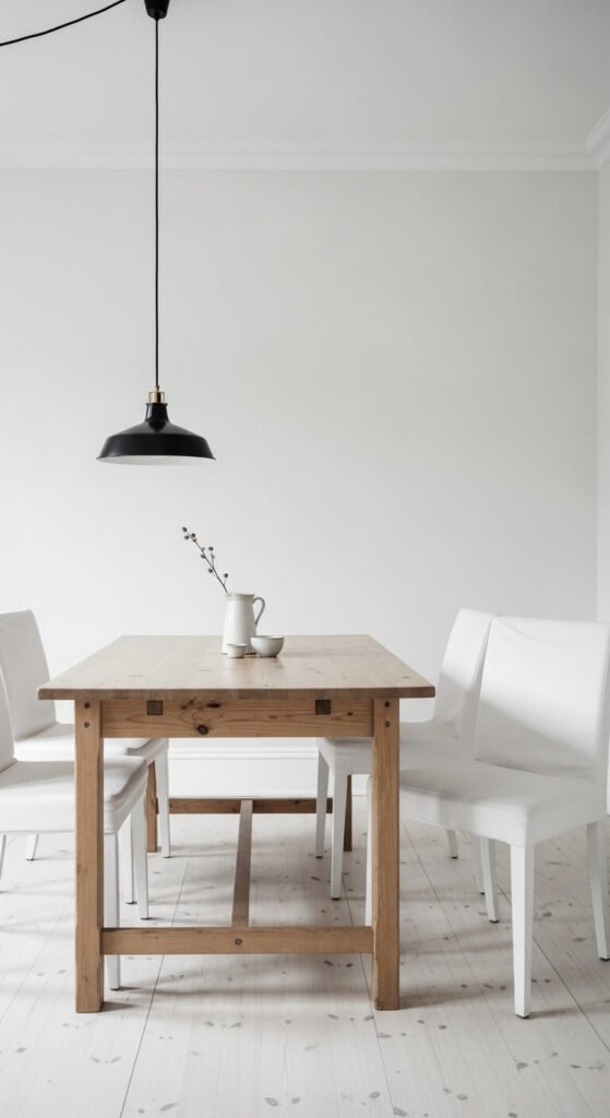
Chalk white and raw wood is the Scandinavian palette that never fades because it’s rooted in simplicity and honest materials. It reflects light, making it work in any room size. The raw wood — pine, birch, or beech — carries all the warmth that white alone can’t hold. Budget tip: Unfinished pine furniture from IKEA’s basic range, left natural rather than oiled or varnished, reads as a deliberate design choice in this palette. The restraint is the point.
11. Warm Terracotta and Nude
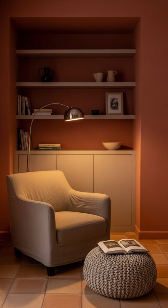
Terracotta paired with nude and warm white becomes a palette that transcends any single trend. It’s earthy, warm, and connects a room to something ancient and grounded. Use it as an accent wall, painted shelving, or a single tiled surface. Budget tip: Mix a small amount of raw umber craft paint into standard white wall paint for a custom terracotta wash. Apply unevenly for a limewash effect. The whole thing costs under $10 and looks completely hand-done.
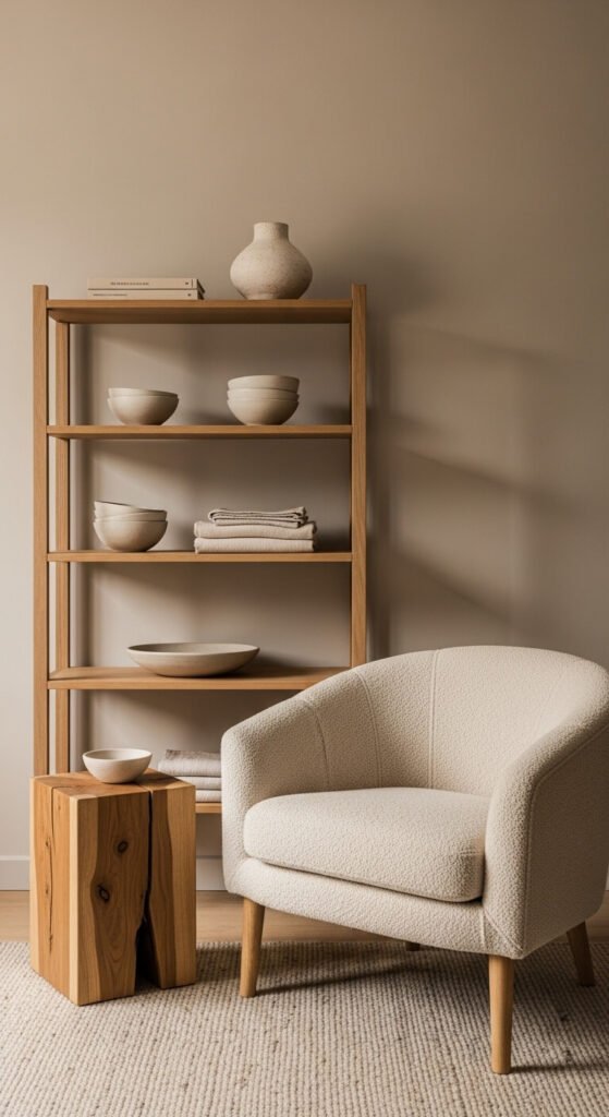
12. Aged Bone and Dark Walnut
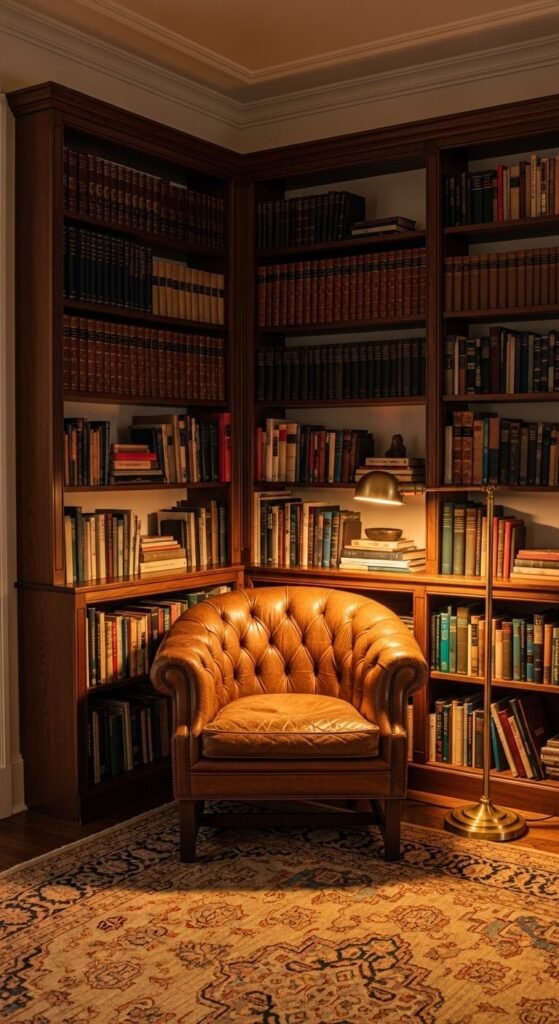
Aged bone — that yellowy, slightly dusty white — paired with dark walnut creates a palette that feels mature and deeply rooted. It suggests history. It works especially well in home libraries and studies where accumulated time is the whole point. Budget tip: Walnut-effect contact paper applied carefully to flat-pack shelving reads convincingly from any normal distance. Applied to a basic Billy bookcase, it takes the piece somewhere entirely different for under $15.
13. Wet Sand and Storm Cloud Grey
This palette captures the feeling of being at the coast just before rain. Wet sand is warm; storm grey is cool. The tension between them keeps the palette alive. They don’t fight — they coexist with quiet drama. Use this in bedrooms or bathrooms where you want calm with a slight edge. Budget tip: Before buying new linen, layer what you already own in grey and sand tones in slightly different weights and weaves. The mix often creates the look without spending anything.
14. Limestone and Pale Gold
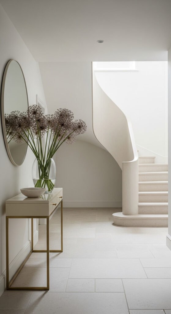
Limestone’s soft, dusty surface is one of the most naturally beautiful neutrals in existence. Paired with pale gold rather than bright gold, the result is refined rather than opulent. This works beautifully in entryways where first impressions matter. Budget tip: Limestone tile off-cuts and cut ends are often sold cheaply by tile merchants. Use them for smaller areas — a bathroom floor, a fireplace hearth, or a kitchen splashback — for a fraction of the full tile price.
15. Oatmeal and Fog
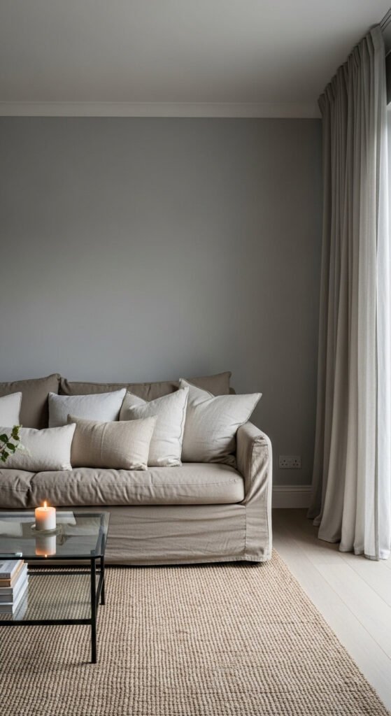
Oatmeal and fog are the most underrated pairing in neutral decor. Neither tries to be the hero. Together they create a room that feels endlessly restful. The key is generosity of scale — big sofas, heavy curtains that pool on the floor, and layered rugs in the same tonal family. Budget tip: A fog grey wall paired with an oatmeal sofa already works. Add a $20 jute rug from a discount homeware store and the room settles completely into itself.
16. Natural Flax and Clay
Natural flax is the colour of undyed linen left in sunlight — warm beige with a hint of straw. Paired with clay-toned plaster walls, it reads artisan and handmade without trying. Use it in kitchens and sunrooms where natural materials already exist. Budget tip: Undyed linen fabric is actually cheaper than printed alternatives because there’s no dyeing cost. Search “natural unbleached linen fabric” and make simple Roman blinds at home using iron-on hem tape and a basic online tutorial.
17. Pearl and Polished Nickel
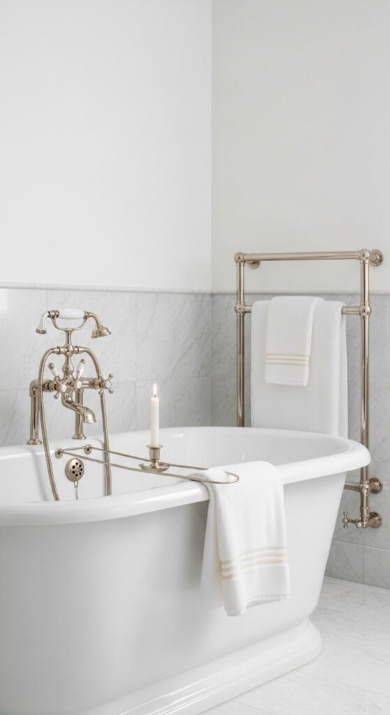
Pearl is a white that catches light slightly differently in every corner of the room. It has a soft luminosity that flat white simply doesn’t have. Paired with polished nickel — cooler and softer than chrome — the result is a bathroom that reads like a five-star hotel without the bill. Budget tip: Polished nickel soap dishes, toothbrush holders, and towel rings are widely available for under $25 on Amazon. Swap out the visible accessories before replacing any fixed fittings.
18. Warm White and Black Ironwork
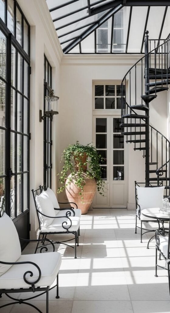
This is the palette of Parisian apartments and old English conservatories. Warm white against black ironwork reads graphic but never harsh — the warmth in the white softens the black entirely. Use iron or black-painted steel in window frames, stair railings, or light fixtures. Budget tip: Black iron furniture is among the cheapest outdoor furniture available. Bring it inside, add white linen cushions, and it looks completely intentional. Garden centres often sell it heavily discounted at the end of each season.
19. Undyed Cotton and Raw Plaster
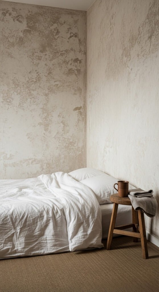
Raw plaster walls have an honesty and depth that painted walls can’t replicate. Paired with undyed, unbleached cotton in bedding and curtains, this palette becomes almost meditative. It’s about removing rather than adding. Nothing is dyed, treated, or processed. Budget tip: Undyed cotton fabric is genuinely cheaper than printed alternatives — no dye cost is passed on. Make simple unlined curtain panels with iron-on hem tape. The texture alone carries the entire window treatment.
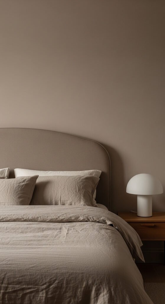
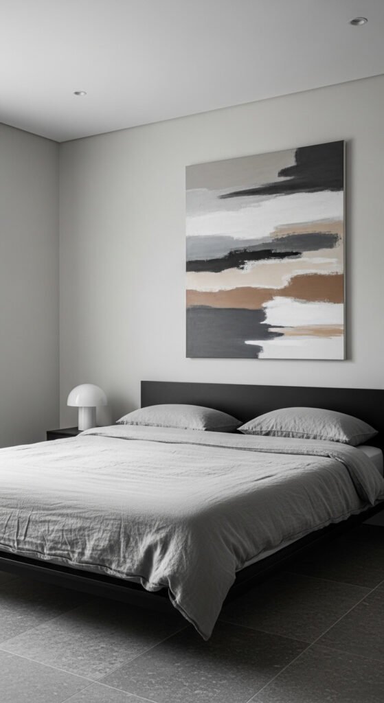
20. Mink and Dove Grey
Mink — a warm, pinkish-brown grey — is one of the most flattering neutrals in a bedroom. Paired with dove grey, the two tones create a room that wraps around you. Both are warm enough to feel cosy but grown-up enough to avoid feeling dated. Budget tip: Mink velvet cushion covers are available widely for under $10 each. Add four to a dove-grey bed and the palette is established immediately — without touching a wall or buying a single piece of furniture.
21. Antique White and Seagrass
Antique white has a softness and age to it that fresh white lacks. It doesn’t glare. Paired with natural seagrass, the room feels organic and slowly gathered rather than bought all at once. This is also one of the most affordable palettes to pull together. Seagrass rugs and antique white paint are among the cheapest options in their categories. Budget tip: IKEA’s natural seagrass and jute rugs offer genuine value. Layer two different sizes for a more considered look that costs far less than one expensive rug.
22. Cool Stone and Aged Mirror
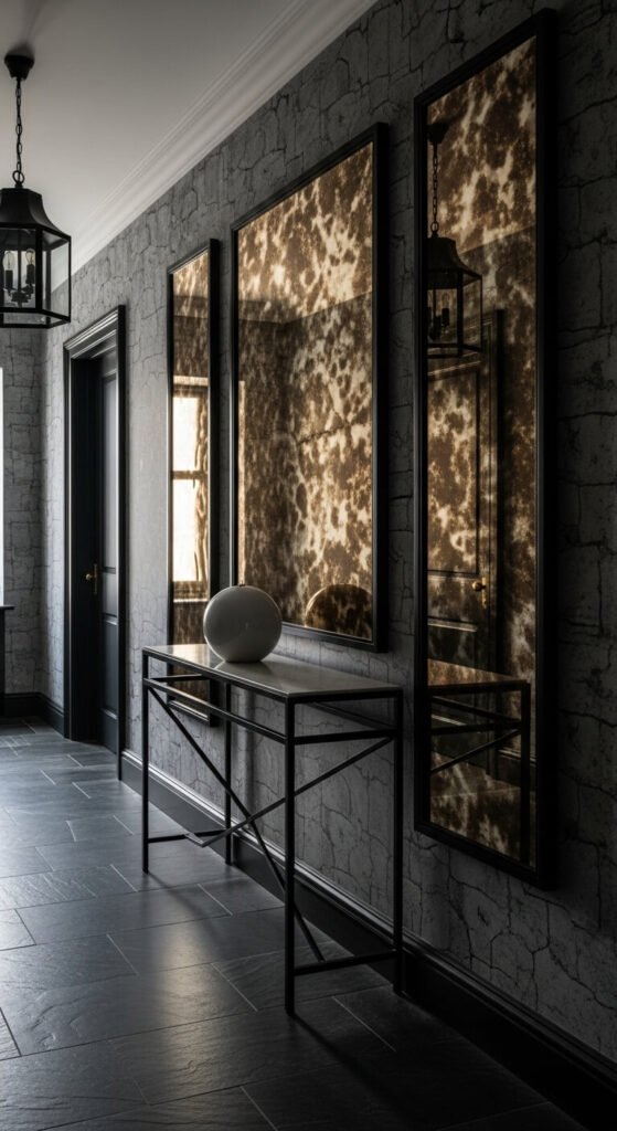
Aged or foxed mirrors — antique glass panels marked with dark spots and silvering loss — bring a depth to a neutral room that nothing else can. Paired with cool stone grey, they create an atmosphere of quiet history. Budget tip: A DIY foxed mirror is achievable in a single afternoon. Apply silver leaf to the back of regular glass, then dab small amounts of black paint irregularly across the surface. Search “DIY foxed mirror technique” — the result is genuinely striking and costs under $15.
23. Warm Alabaster and Tortoiseshell
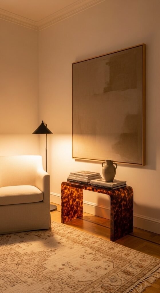
Alabaster is a white with visible warmth — almost glowing from within rather than simply reflecting light. Paired with tortoiseshell accents in brown, amber, and dark honey, the combination feels organic and slightly vintage. Tortoiseshell trays, frames, and lampshades are all widely available. Budget tip: Acetate tortoiseshell contact paper transforms a basic tray or picture frame for under $5. Apply carefully and trim edges cleanly — from any conversational distance, it reads as genuine resin with no hesitation.
24. Greyed Lavender and Limestone
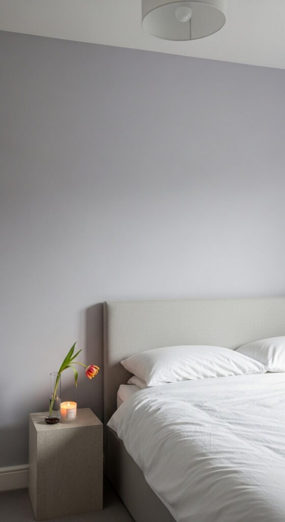
Greyed lavender sits right at the edge of neutral. In most lights it reads not as purple but simply as a slightly cooler, calmer grey. Paired with limestone and white, it has a spa-like quality that works especially well in bedrooms. Budget tip: Mix a tiny amount of purple craft paint into standard grey wall paint to create a custom greyed lavender shade at zero extra cost. Make a test patch, live with it for a full day across different light conditions, then decide.
25. Smoked Oak and Dark Ecru
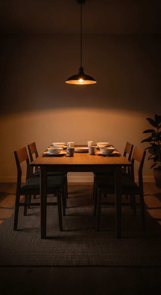
Smoked oak is regular oak treated to a deeper, darker brown-grey. Paired with dark ecru — a warm off-white leaning toward tan — the combination is earthy and intimate. This palette works particularly well in dining rooms where you want a sense of occasion without anything feeling theatrical or overdone. Budget tip: Smoked oak effect on existing furniture is achievable with dark walnut wood stain diluted in water and wiped on with a cloth. Test on a hidden area first. Subtle, warm, and permanent.
Conclusion
Neutral decor isn’t about playing it safe. It’s about playing it well. Every palette here shares the same quality: it ages gracefully, layers beautifully, and works alongside almost any piece of furniture you already own. Pick the one that feels most like you. Start with a single wall, a rug, or a set of cushions. See how it lives in your light, your space, your everyday life. You don’t need to change everything at once. The best neutral rooms are built slowly — one honest, considered choice at a time. That’s exactly what makes them last.