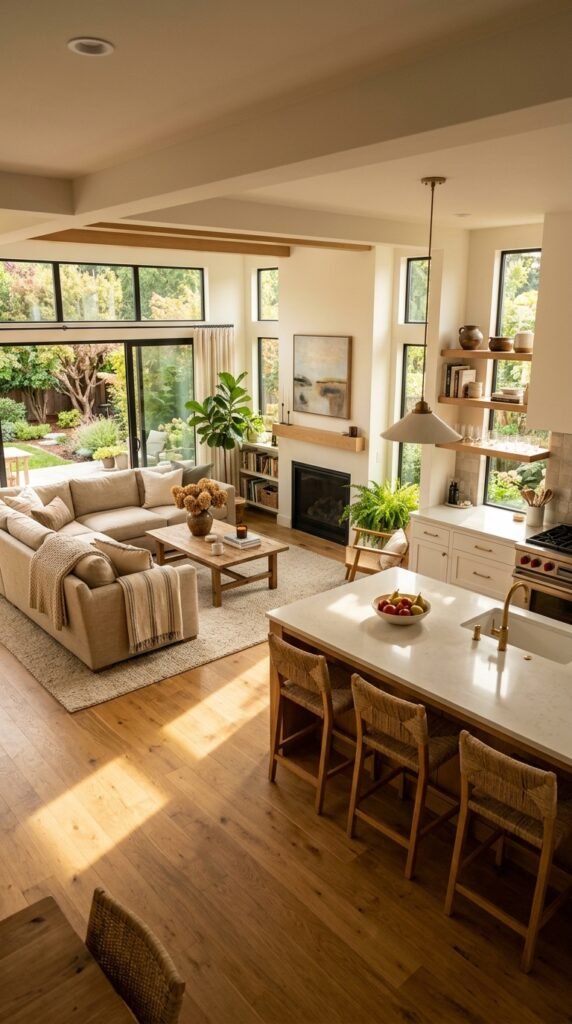
Good movement through a home rarely happens by accident. Every hallway width, doorway placement, and room connection either helps people move with ease or creates daily friction. If you’ve ever felt boxed in by a chopped-up layout or annoyed by a kitchen that fights your every step, the fix usually comes down to layout choices, not square footage. Below are 25 layout ideas that homeowners and renters alike can use to make any space feel roomier, calmer, and easier to live in — many of them doable on a weekend budget.
Open Kitchen-to-Living Connections
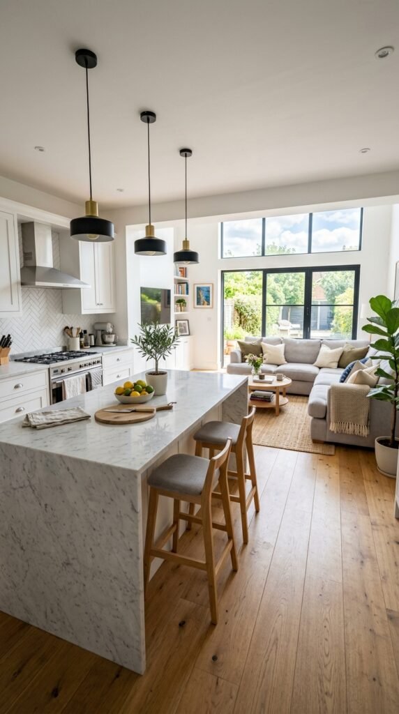
Removing a wall between the kitchen and living room changes how a home feels overnight. People can cook while chatting with guests instead of being cut off. If a full wall removal is out of budget, try a pass-through opening instead. A contractor can cut a 3-foot window into a non-load-bearing wall for a fraction of the cost. Add a shared paint color on both sides to blur the line further. This small change makes a home feel twice as open without touching the foundation.
Split-Level Zone Separation
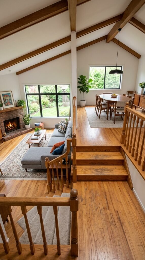
Split levels use small elevation changes to separate loud zones from quiet ones. A few steps up or down signal a shift in purpose without needing a door. This works well for renters too. Use a rug on the lower step to visually mark the transition if your home is already split-level. Adding a half-wall or open railing instead of a solid wall keeps sightlines open while still giving each zone its own identity. It’s a layout trick that costs nothing if the structure already exists.
Wide Hallways for Easy Movement
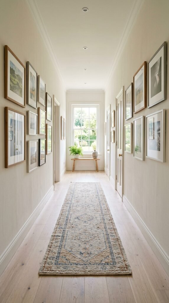
Narrow hallways create bottlenecks, especially in busy households. Widening a hallway by even a few inches can change how a home feels day to day. If knocking down walls isn’t realistic, remove bulky trim or built-in shelving that eats into the walkway. A slim console table should only go in a hallway wider than 4 feet. Light-colored walls and a runner rug also trick the eye into seeing more space. This is one of the cheapest fixes for a home that feels tight.
Angled Entryways
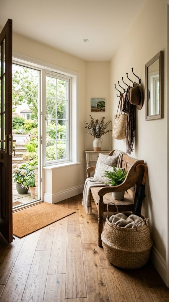
A straight-on entry can dump guests right into the middle of a room. An angled entry softens that first step inside. If your entryway is already fixed, use furniture to create the angle instead. Place a bench or shoe rack diagonally near the door to redirect foot traffic naturally. This small shift gives visitors a moment to pause before entering the main living space. It also hides the rest of the room from direct view when the front door opens, adding privacy.
The Kitchen Work Triangle
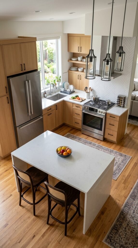
The classic kitchen work triangle connects the stove, sink, and fridge in a triangle shape so cooking never feels like a workout. If your kitchen already has this setup, keep the paths clear of clutter. If it doesn’t, a rolling cart can act as a temporary prep station to shorten the distance between zones. Even swapping cabinet contents so pots sit near the stove and dishes sit near the sink saves steps every single day. Small adjustments like these add up fast in a busy kitchen.
Great Room Layouts
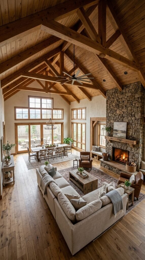
A great room merges the living, dining, and sometimes kitchen space into one large area. Instead of walls, furniture groupings define each zone. This layout works in smaller homes too. Use a large area rug to anchor the seating area and a separate rug or lighting fixture over the dining table. This visual separation keeps the space organized without adding a single wall. It also keeps conversation flowing between rooms, which is why open floor plans remain popular for families.
Double Doorways Between Rooms
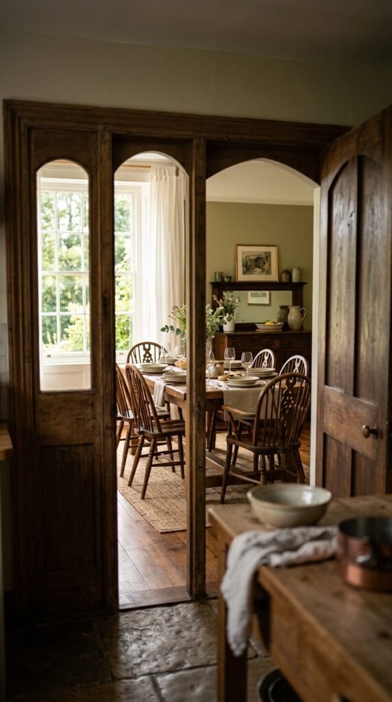
Two doorways connecting the same two rooms create a loop instead of a dead end. This matters more than people expect, especially during parties or busy mornings. If your home only has one entry point between rooms, consider widening a nearby closet doorway into a second pass-through. It’s a bigger project, but even a curtain-covered opening can serve the same purpose temporarily. A loop layout keeps foot traffic moving instead of forcing everyone to backtrack through the same narrow gap.
Pocket Doors for Flexible Space
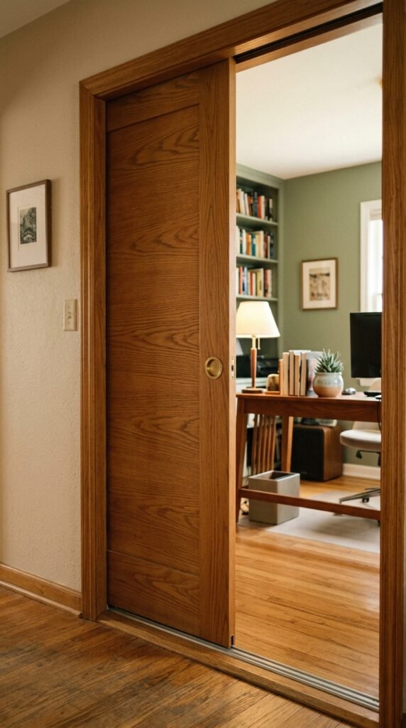
Swinging doors eat up floor space that pocket doors give right back. A pocket door slides into the wall instead of swinging into the room. This works well for small offices, bathrooms, or laundry nooks. Installing one is a weekend project for anyone comfortable with basic tools, and kits are sold at most hardware stores. The payoff is real: a room that felt cramped suddenly has room to breathe. It’s a small swap with a big impact on how furniture gets arranged.
Aligned Sightlines
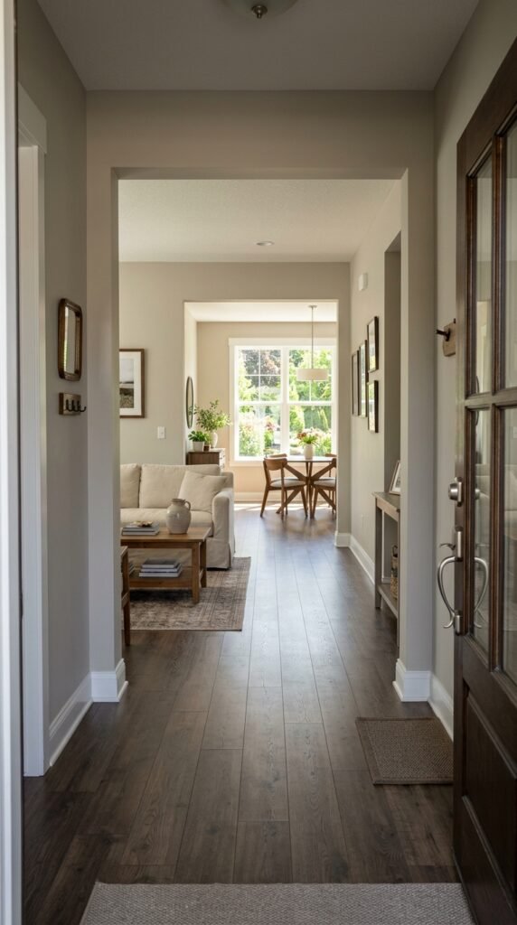
Aligning doorways and windows so they line up creates a clear sightline through the home. Standing at the front door and being able to see straight through to a window at the back makes a home feel bigger than it is. If your doorways don’t naturally align, use mirrors to fake the effect. A well-placed mirror at the end of a hallway can double the perceived depth of a room. This trick costs less than fifty dollars and works in almost any layout.
Mudroom Drop Zones
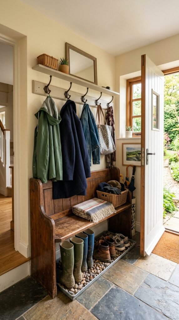
A drop zone near the entry keeps shoes, bags, and coats from spreading through the rest of the home. Even a small corner can work if it has hooks, a bench, and a tray for shoes. This isn’t limited to homes with a dedicated mudroom. A thrifted bench and a few command hooks near any side or back door create the same effect for under thirty dollars. Keeping this clutter contained near the entry point stops it from disrupting movement through the rest of the house.
L-Shaped Layouts
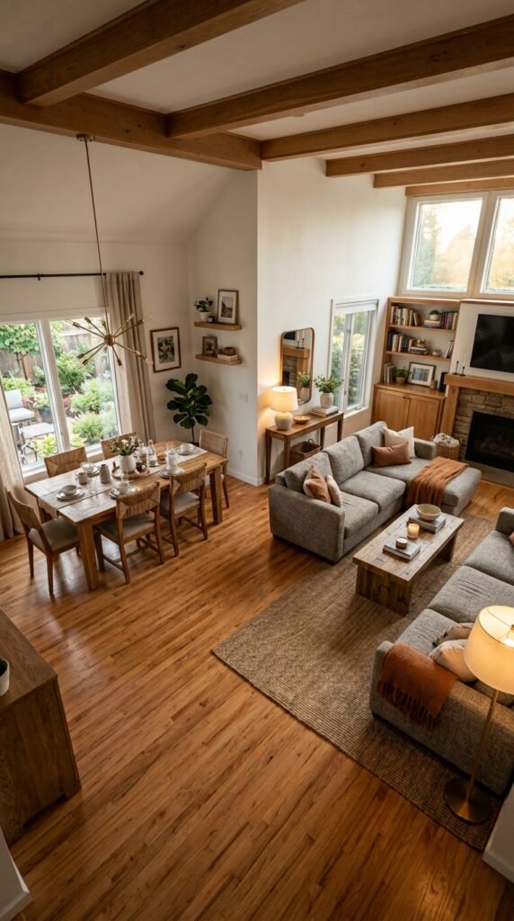
An L-shaped room naturally splits into two zones without needing a wall. One arm of the L can hold a dining table while the other holds a couch and TV. This layout works especially well in older homes with irregular room shapes. Instead of fighting the angle, lean into it. Place a bookshelf or plant at the bend to soften the corner and guide movement around it. This layout turns an awkward shape into two usable, distinct spaces.
Galley Kitchen Efficiency
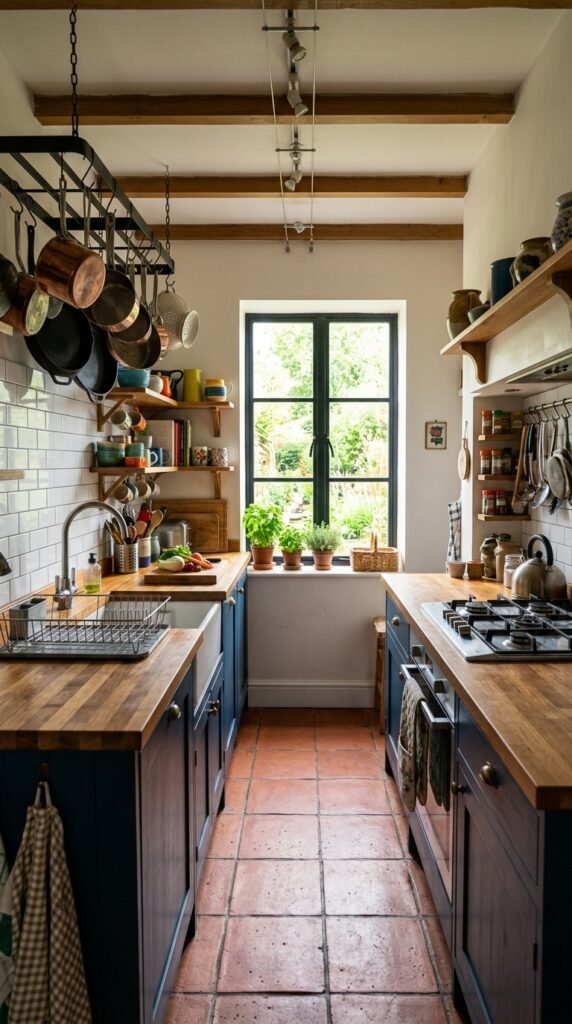
A galley kitchen lines up counters on both sides with a walkway in between. It’s compact, but it can also be one of the most efficient kitchen shapes when done right. Keep the walkway clear of rolling carts or trash bins that block movement. A magnetic knife strip and wall-mounted spice rack free up counter space without needing new cabinets. Galley kitchens work best when everything has a fixed spot, since there’s little room for anything to sit out of place.
Split Bedroom Floor Plans
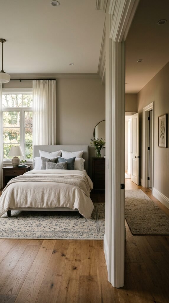
A split bedroom layout places the primary bedroom on one side of the home and other bedrooms on the opposite side. This gives everyone more privacy and cuts down on noise between rooms. If you can’t change the structure, use a white noise machine or a rug to dampen sound between adjoining bedrooms. Rearranging which family member uses which room can also mimic a split layout, putting the loudest sleepers or earliest risers farther from shared walls.
Circular Traffic Patterns
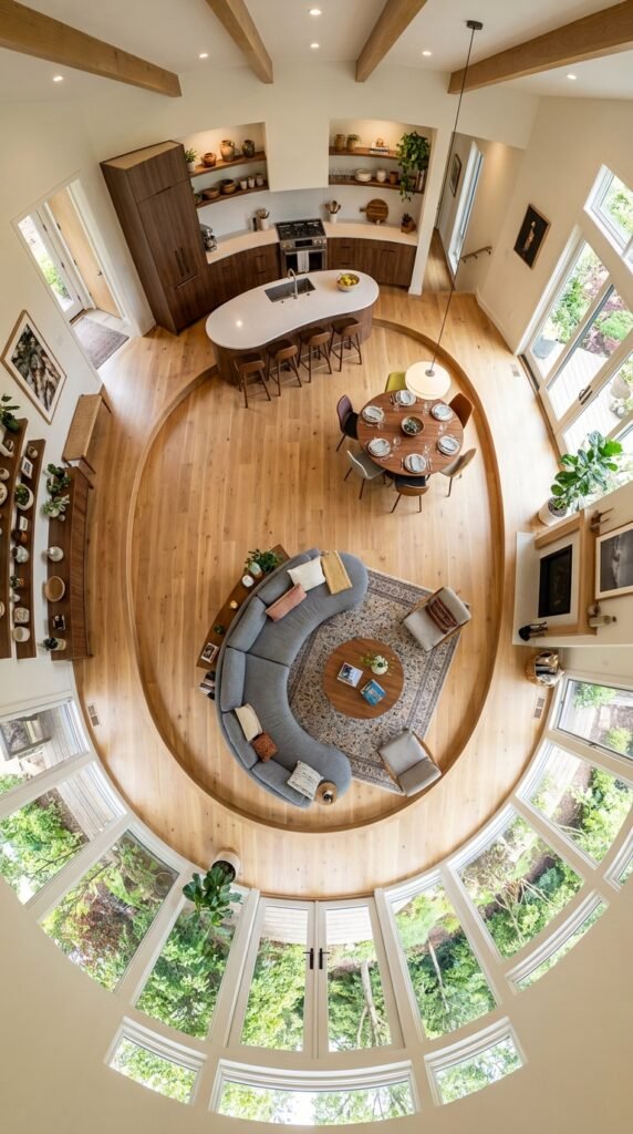
A circular traffic pattern lets people walk in a loop through connected rooms instead of hitting a dead end. This matters most in homes with kids or pets, where constant back-and-forth movement is normal. Rearranging furniture to open a path around an island or coffee table can create this loop without any construction. Pull furniture a few inches away from walls to open a walking lane on all sides. A loop layout reduces collisions and makes busy mornings less chaotic.
Bump-Out Additions
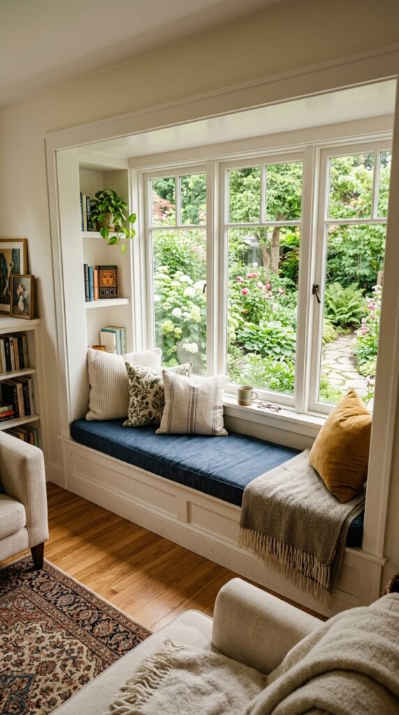
A bump-out extends a single wall outward instead of adding a full room. It’s a smaller, cheaper way to gain a reading nook, extra counter space, or a wider hallway. Homeowners on a budget can start with a small bump-out for a window seat instead of a full addition. Even a few extra feet can turn a cramped corner into a usable spot. This works well for older homes where a full addition isn’t in the budget but a small square footage boost is.
Loft-Style Layouts
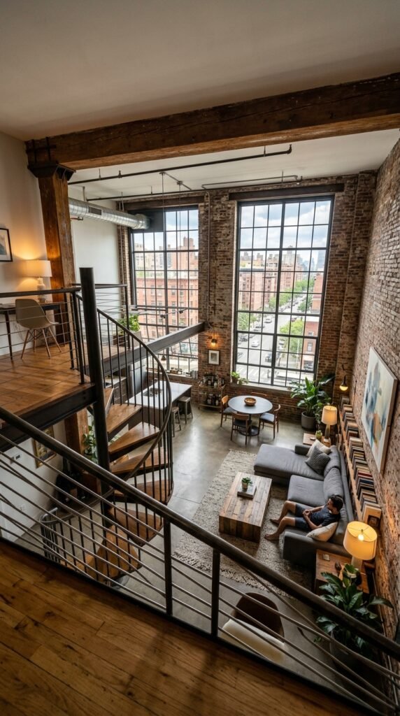
Loft layouts stack living space vertically instead of spreading it across one floor. A raised platform bed or office nook above a main living area adds square footage without expanding the footprint. This works in apartments and small homes alike. A simple ladder or compact staircase can turn unused ceiling height into a usable loft space. Keep the area below open so light and movement still flow underneath. It’s a layout trick that makes small spaces feel far larger.
U-Shaped Layouts
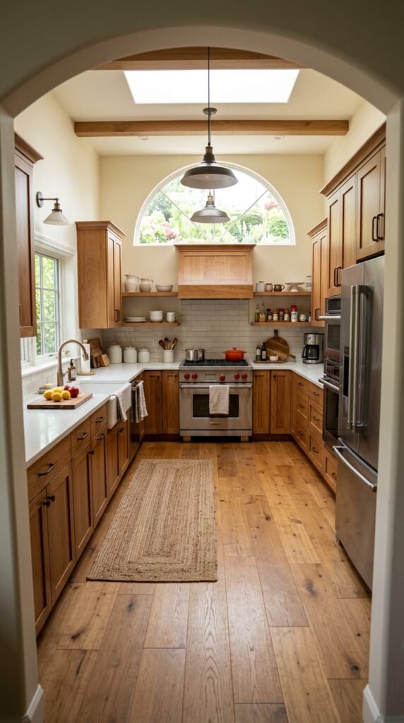
A U-shaped layout wraps counters or seating around three sides of a room, leaving the center open for movement. Kitchens use this shape often, but living rooms can too. Arrange a sectional couch in a U-shape around a coffee table to create a cozy, contained seating zone. This layout keeps everything within reach without crowding the middle of the room. It works especially well for people who entertain often, since guests can flow around the open center easily.
Breakfast Nooks
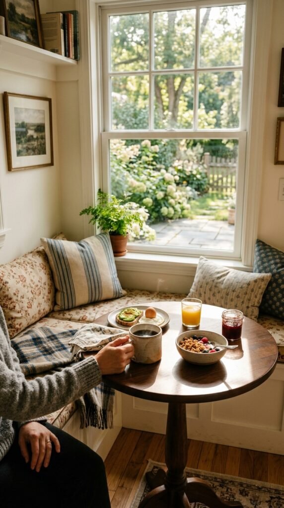
A breakfast nook pulls everyday meals out of the main dining room, freeing that space for other uses. Even a small corner near a window can work with a round table and two chairs. This layout keeps the kitchen social without crowding the main walkway. A secondhand table and a bench built from stacked crates can create the same feel for under a hundred dollars. Nooks work best tucked into a corner that isn’t part of the home’s main traffic path.
Butler’s Pantry Pass-Throughs
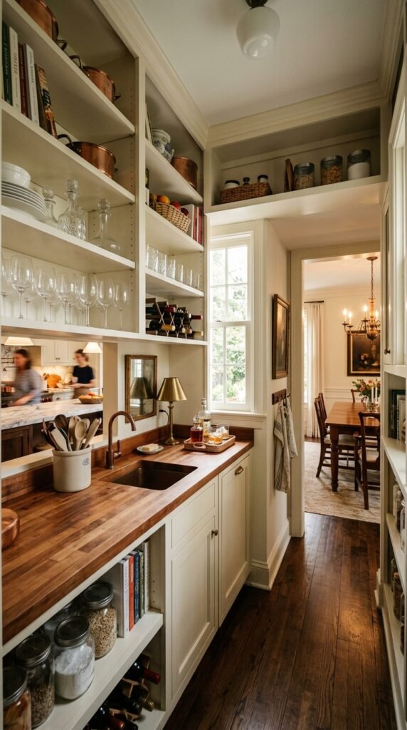
A butler’s pantry sits between the kitchen and dining room, giving extra storage and a buffer zone for serving food. It also keeps kitchen mess out of sight during meals. A narrow closet between these two rooms can be converted into a mini version with open shelving and a small counter. This layout keeps the cooking mess contained while still letting food move quickly from stove to table. It’s a small addition that changes how hosting feels in a home.
Home Office Nooks
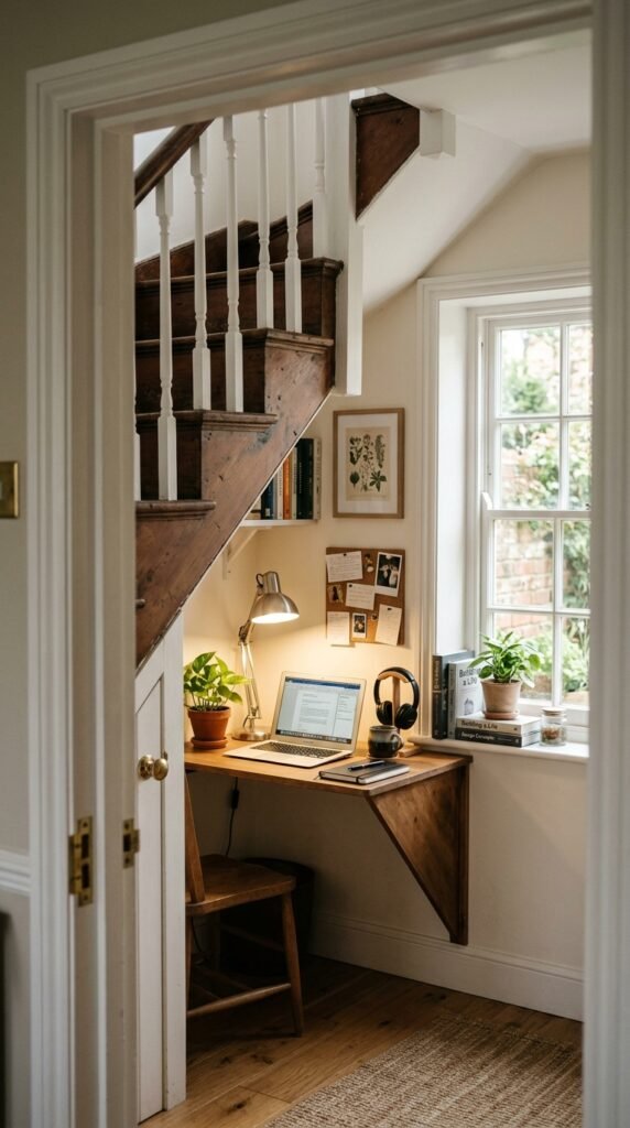
A dedicated work nook, even a small one, keeps work supplies from taking over the dining table. Unused space under a staircase or at the end of a hallway can become a functional desk area. A wall-mounted fold-down desk works well in tight spots and can be tucked away when not in use. This layout keeps work zones separate from living zones, which makes both areas feel more organized and easier to walk through during the day.
Multi-Purpose Rooms
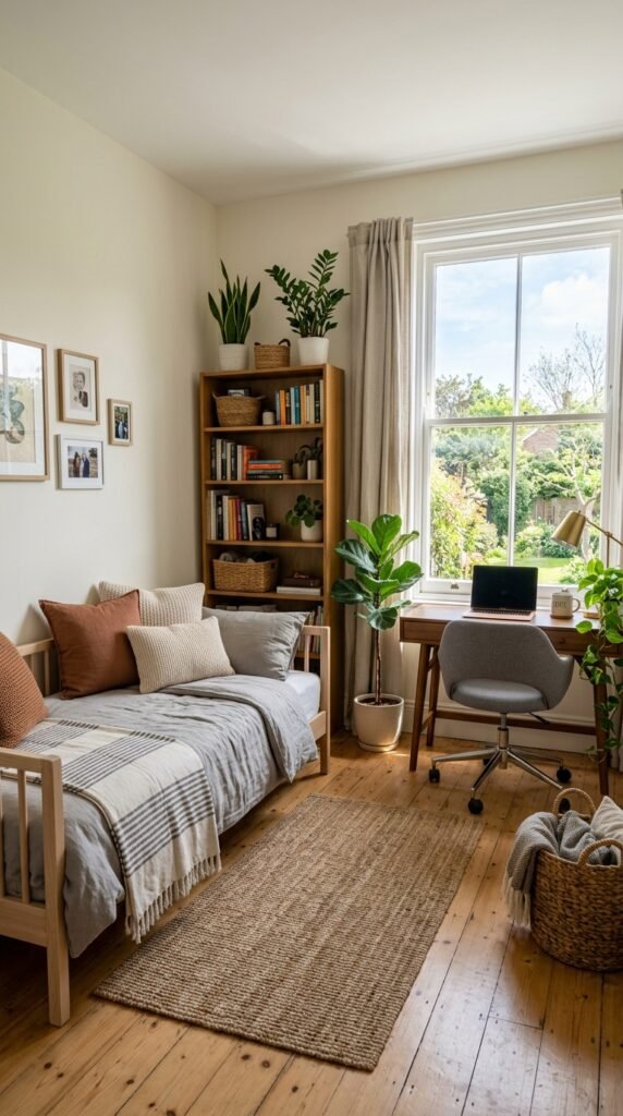
A multi-purpose room does double or triple duty, serving as a guest room, office, and hobby space all in one. Furniture that folds, stacks, or rolls away makes this layout work. A daybed instead of a full bed frees up floor space during the day. This layout suits smaller homes where a single-purpose room isn’t practical. Keeping the furniture light and mobile lets the room shift roles quickly without feeling cluttered or overstuffed with unused items.
Wraparound Porches
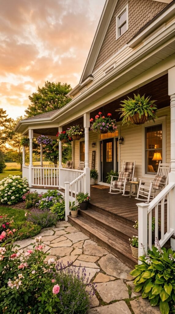
A wraparound porch extends outdoor living space around multiple sides of a home, giving more than one entry and exit point. This layout improves flow between indoor and outdoor areas, especially during warmer months. Homeowners without a full wraparound porch can add a small side deck instead to get a similar effect on a smaller budget. Adding a second door from a side room to an outdoor space also shortens the path outside, which helps during gatherings or everyday trips to the yard.
Strategic Staircase Placement
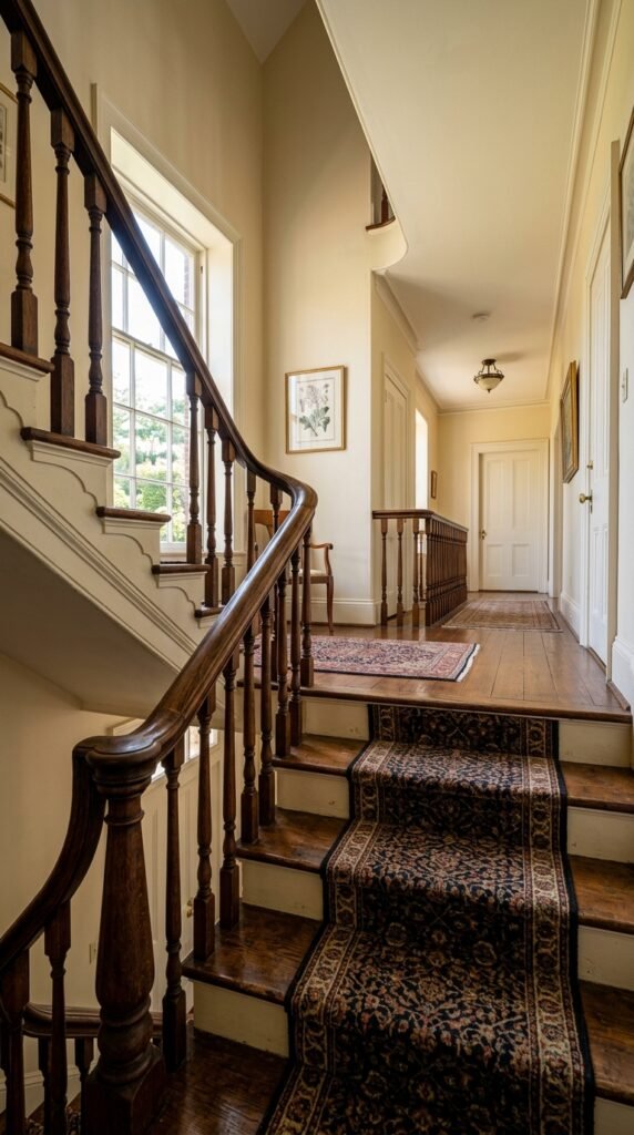
A staircase placed near the center of a home connects every level with the shortest possible path. Staircases tucked into a far corner often create long, awkward hallways. While moving a staircase is a major renovation, smaller homes can improve flow by keeping the base of the stairs clear of furniture and clutter. A runner rug on the stairs also visually connects the levels and softens the transition between floors. Clear sightlines up the stairwell make the whole home feel more connected.
Natural Light Placement
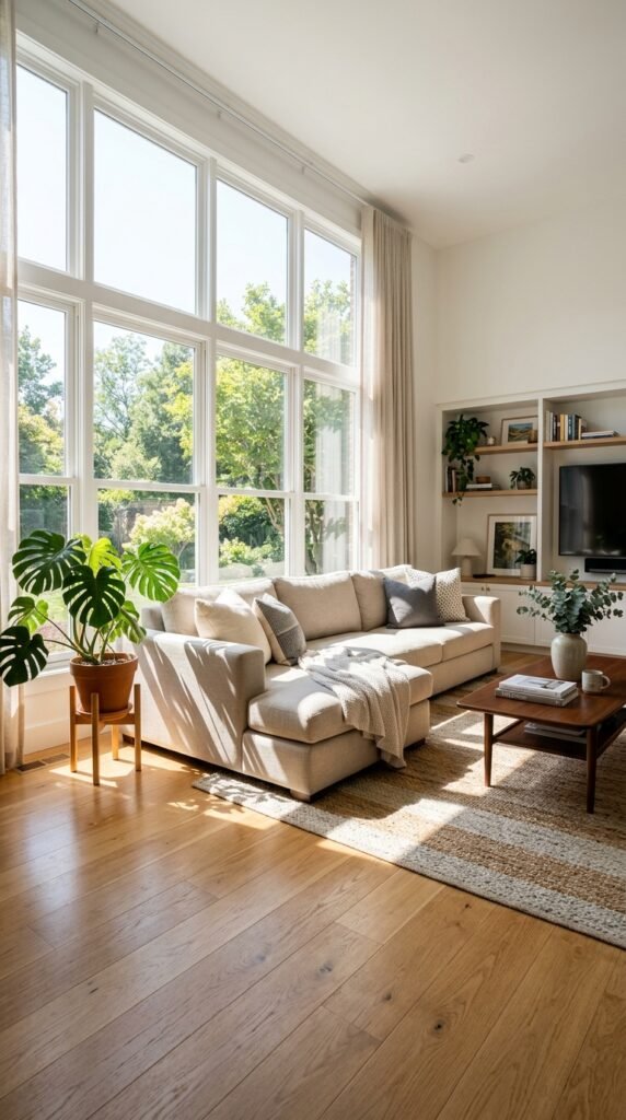
Rooms with windows on two walls instead of one feel more open and easier to move through, since natural light removes visual barriers. If your layout can’t change, mirrors placed across from windows bounce light deeper into the room. Swapping heavy curtains for sheer panels also lets more daylight in without any construction. A well-lit path is a path people move through with more confidence, which matters more than most homeowners realize when planning a layout.
Furniture Zoning
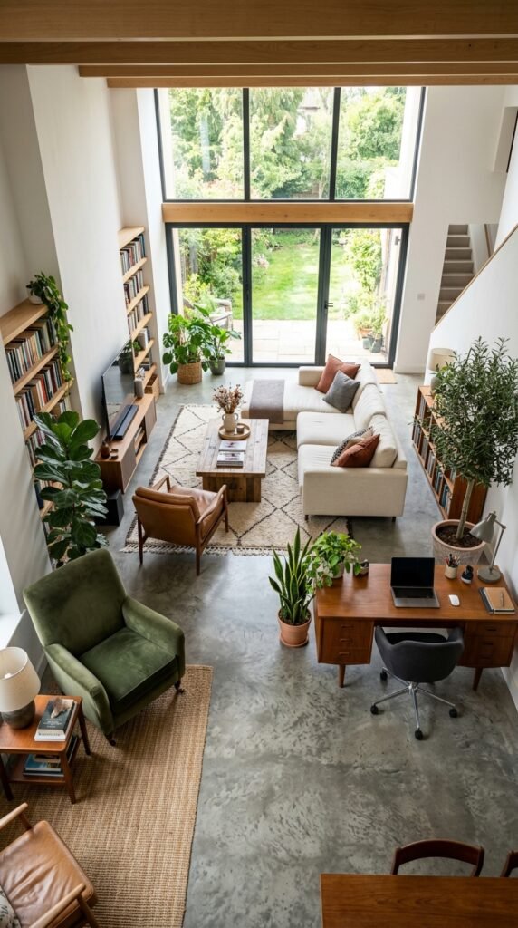
Furniture zoning uses rugs, lighting, and seating groups to create separate areas within one open room. This is one of the cheapest ways to improve flow, since it requires no construction at all. Group a couch and chairs around a rug to define a living zone, then use a different rug or floor lamp to mark a reading corner nearby. This layout trick works in studio apartments just as well as it does in large open-concept homes.
Doorway Widths
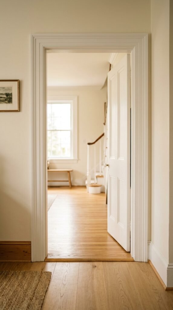
Standard doorways are around 30 to 32 inches wide, but widening even one or two key doorways can change how furniture moves through a home. This matters most between kitchens, living rooms, and hallways where traffic is heaviest. A contractor can widen a non-load-bearing doorway for a modest cost, or removing a door entirely can open the passage further at no cost at all. Wider doorways make everyday movement, moving day, and furniture delivery far less stressful.
Conclusion
Small layout choices carry more weight than most people expect. From wider doorways to angled entryways, each idea on this list can be tackled on its own, without a full renovation budget. Start with the change that solves your biggest daily frustration, whether that’s a cramped hallway or a kitchen that feels disconnected from the rest of the home. Over time, these small adjustments stack up into a home that moves the way your family actually lives, proving that better flow is often a matter of smart planning rather than more square footage.